In typography, kerning is the process of adjusting the space between two specific characters. Most of us never give it a second thought, but it’s wild how much that tiny detail can matter.
Put two letters a little too close together, or leave too much room between them, and suddenly a perfectly normal phrase can take on a completely different meaning. Sometimes, the result is hilariously unfortunate.
To show you what we mean, we’ve rounded up the funniest spacing fails from the subreddit r/keming. Scroll down to check them out.
#1 Hyperpig
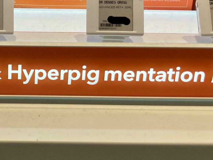
Image source: cambriancalcite_eyes

#2 Player Of Theyear
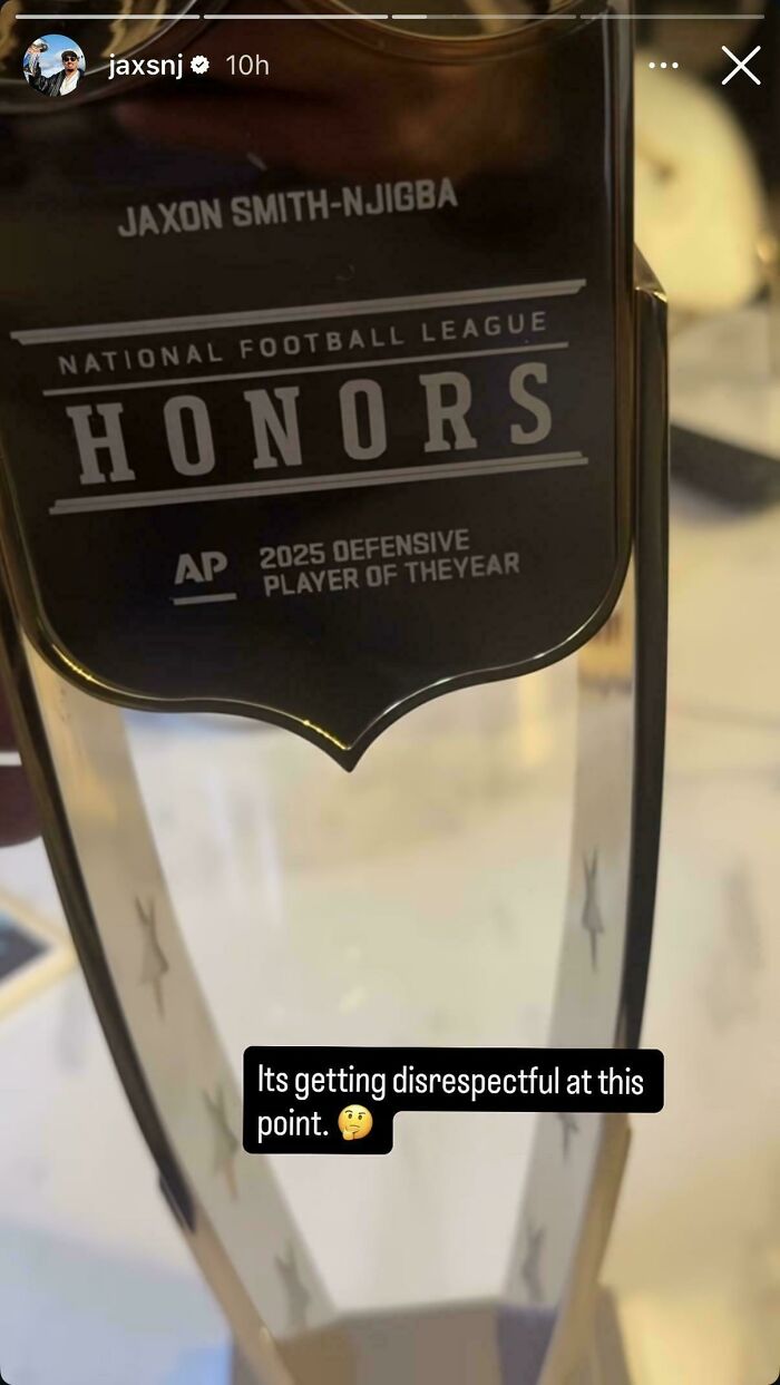
Image source: anon
#3 Not Even Sure What To Title This
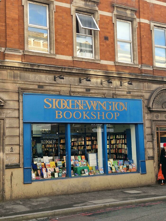
Image source: dogt0wel
At first glance, r/keming might look like someone misspelled the subreddit’s name. In reality, it’s a clever nod to the very problem the community is all about.
When the letters “r” and “n” are placed too close together, they can easily pass for an “m.” Squish them in “kerning,” and you get “keming.”
#4 Bat Hro On
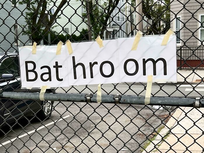
Image source: Far_Violinist_1333
#5 Stay Hydra Ted
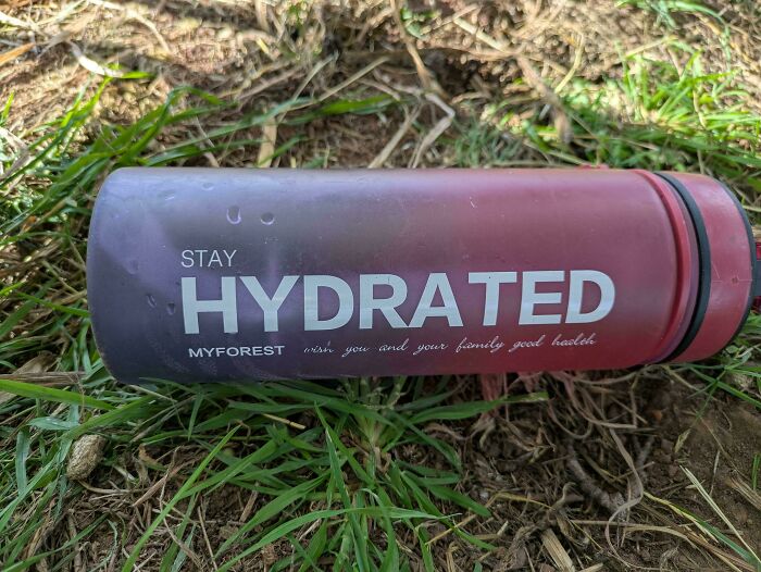
Image source: fl_needs_to_restart
#6 Bamboo Chops Ticks
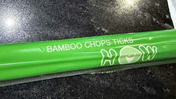
Image source: risingkirin
As we mentioned, kerning is all about the space between letters, and the word itself has a pretty interesting backstory.
According to Vocabulary.com, it comes from the French “carne,” meaning “projecting angle,” which goes back to the Latin word for “hinge.” Its typography meaning was born in old-school print shops.
#7 Thekings Arms
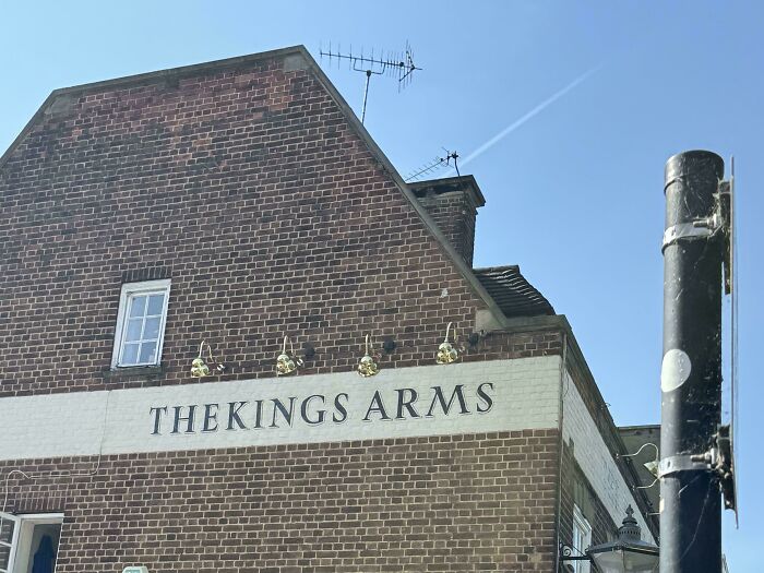
Image source: dangerduhmort
#8 I Was Told To Put This Here
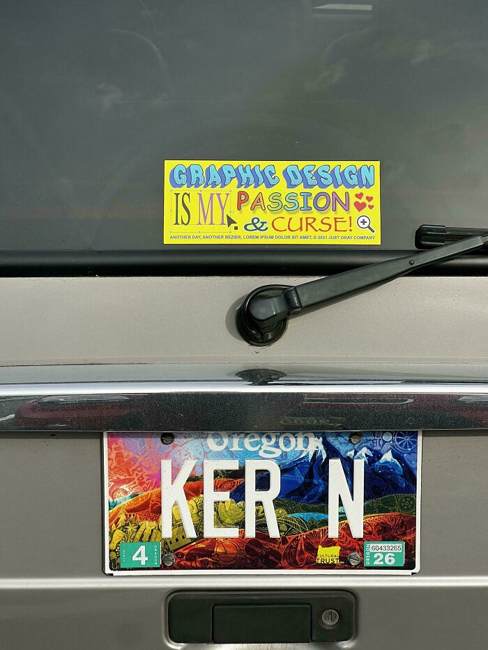
Image source: Galaaska
#9 Finally, Inverse Keming
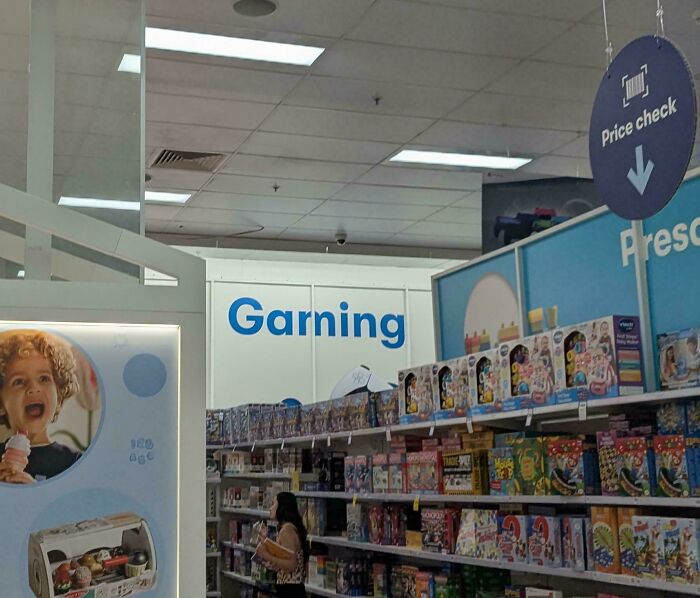
Image source: Mission-Impossible_
Back when printing relied on metal type, every character was cast on its own little block. Some letters, like the tail of a “j” or the top of an “f,” stuck out past the edge of that block.
These overhanging bits were called kerns, and they let neighboring characters sit closer together for a neater fit, as CreativePro explains. Sometimes printers even had to cut away part of the metal itself, so the whole process was slow and expensive.
#10 This Hotel In St. Louis Bothers Me Every Time I Drive Past It
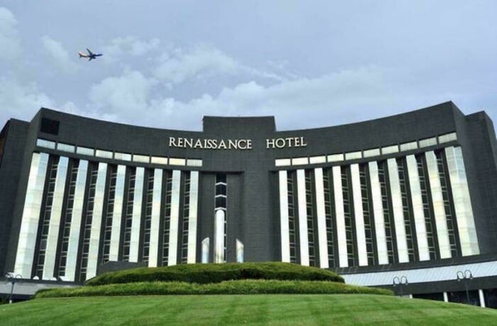
Image source: Drip-Ready
#11 If You Say So!
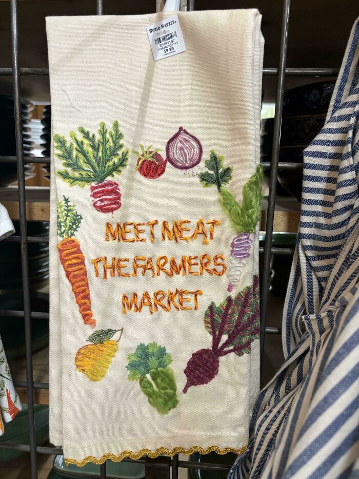
Image source: emmabethh
#12 Egregious… But Inevitable Considering LEGO Strict Sticker Placement Rules, I Suppose
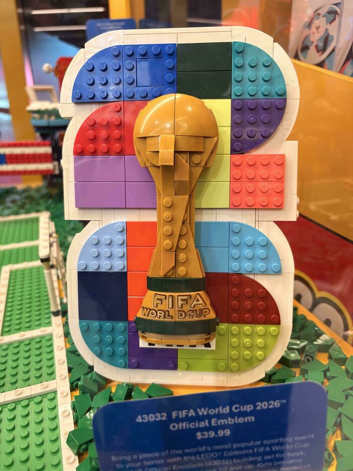
Image source: Aton_Freson
Thankfully, digital fonts made kerning way easier. Most fonts today come with built-in spacing adjustments for tricky pairs, and design software can add or remove space with just a few clicks.
Letter spacing, however, is just one small part of typography. The way text is designed in general plays a huge role in how we take in information. We might not stop to think about it, but it affects us every time we read something.
#13 Opiniona Ted
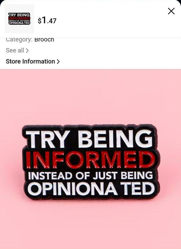
Image source: zecidnac
#14 Wand Er Thr Ough The Worl Ds
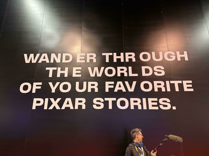
Image source: theGreyWyvern
#15 Leavec Hildren Unatt Ended No
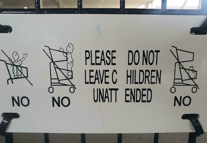
Image source: ToomintheEllimist
In 2012, filmmaker Errol Morris decided to test this with an interesting experiment on The New York Times website.
He posted a quiz titled “Are You an Optimist or a Pessimist?” that asked readers to go through a short passage and decide whether they believed its claim was true. What the 45,000 people who took part didn’t know was that the quiz was really about something else.
Morris wanted to see how people responded to the same passage when it was displayed in different typefaces. Each reader randomly got one of six fonts: Baskerville, Georgia, Computer Modern, Helvetica, Comic Sans or Trebuchet.
As it turns out, people were more likely to believe the passage when it appeared in Baskerville.
#16 Tomado
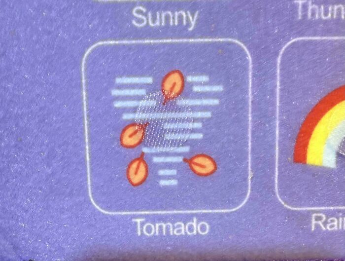
Image source: friedcircuitry
#17 How Do I Even Read This
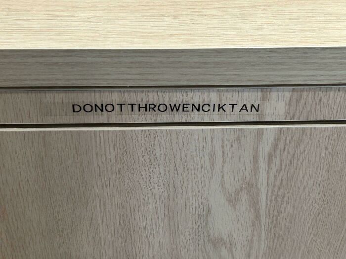
Image source: VersatileCitrus022
#18 Say It In Cry Stals
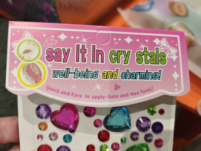
Image source: TheBigMacGaul
Typefaces generally fall into two big families. Serif styles, like Times New Roman, have tiny decorative strokes at the ends of each letter. Sans serif options, like Arial, skip them for a cleaner look.
For years, the common wisdom said serifs belong in print while their sleeker cousins work better on screens. However, after reviewing over a century of research, psychologist John T. E. Richardson found that adult readers generally show no clear preference for either one.
#19 Because The B And A At The Start Of “Barista” Are Too Close, This Actually Says “Frista” In Braille
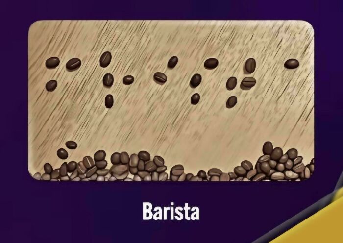
Image source: GreatFail
#20 Found This One At Work
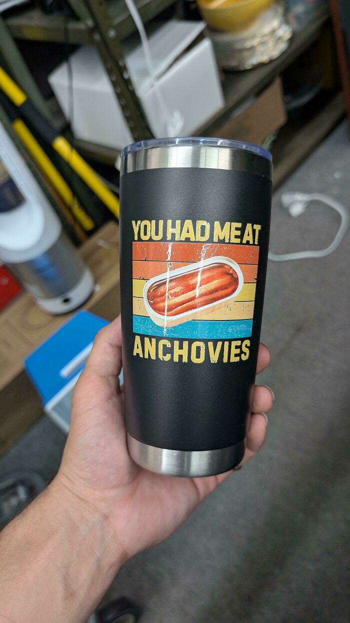
Image source: Routine_Purchase_971
#21 T He O Val O Ffice
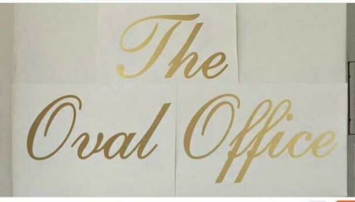
Image source: [deleted]
Steve Jobs was one person who took these little details very seriously. After dropping out of college, he sat in on a calligraphy class and learned about serif and sans serif typefaces, along with how to vary the spacing between letter combinations.
He shared the story during his famous 2005 Stanford commencement speech, saying it all came back to him a decade later while designing the first Macintosh. “It was the first computer with beautiful typography,” Jobs said. He even credited that single class for the Mac having multiple typefaces and proportionally spaced fonts.
#22 Apostrophes Are Wider Than Spaces In Breeze Airways’ Font
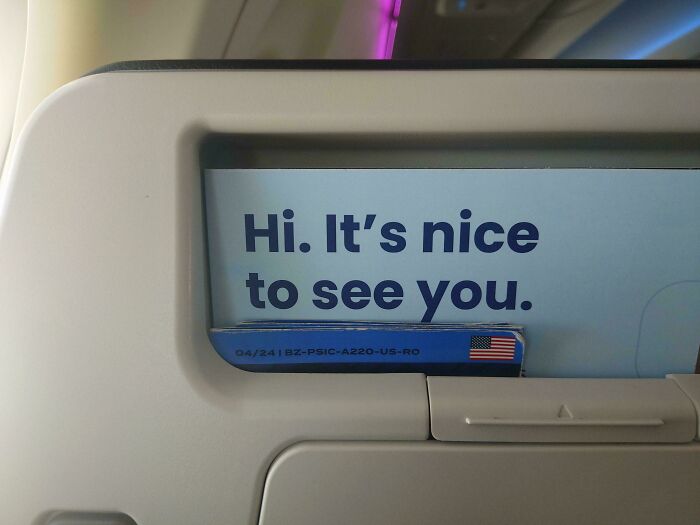
Image source: chikinn
#23 Can You Really Blame This On Kerning?
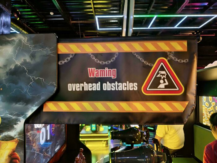
Image source: Corporal_Cavernosa
#24 Con Ven Ience Store
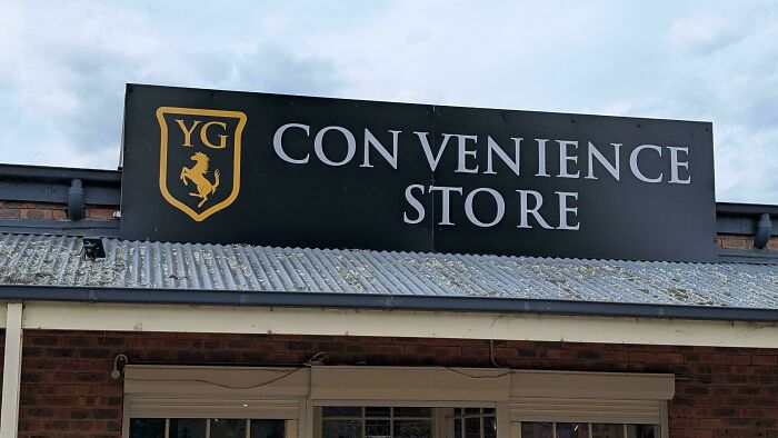
Image source: peteofaustralia
So the next time you walk past a shop sign or scroll through your phone, take a second to notice the letters. A lot of thought usually goes into how they’re shaped and spaced.
And when nobody pays enough attention, well, that’s how we end up with the hilarious fails on this list.
#25 Forsy The Park
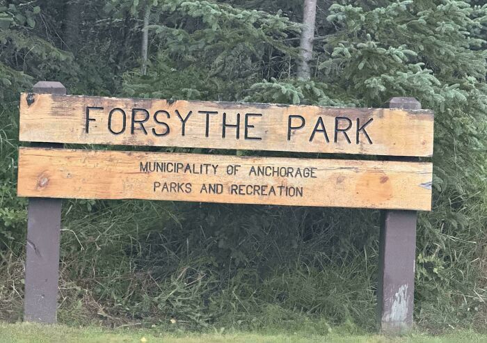
Image source: FrenchFryRaven
#26 Bo W Li Ng
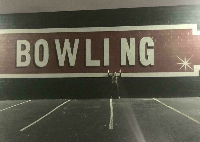
Image source: Careless_Mango_7948
#27 One Does Not Simply Walk Into Mordor
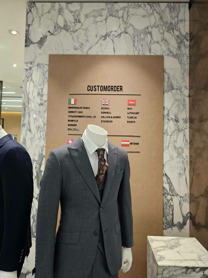
Image source: Sanctioned-PartsList
#28 “M Ake Aw I Sh” From A Shrinky Dink Kit
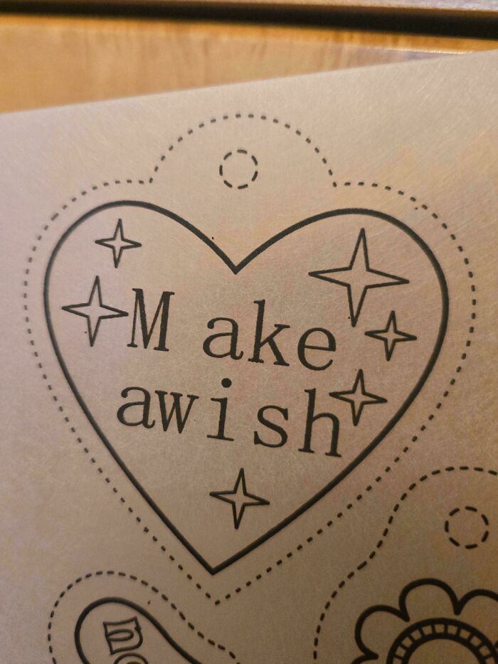
Image source: CrimsonApostate
#29 Empowering The Next Gene Ration
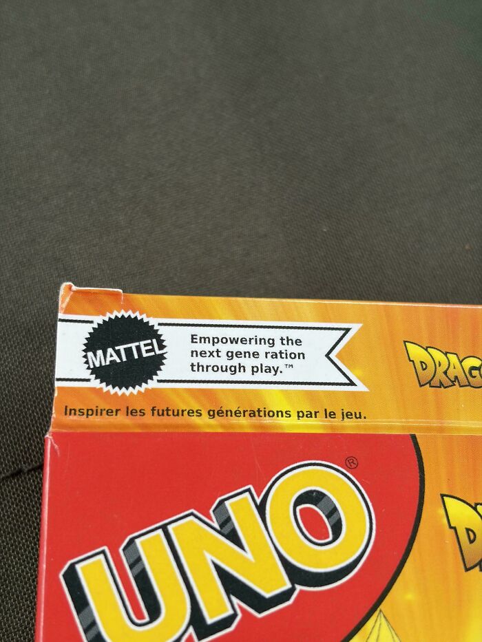
Image source: boredlong
#30 W Elcome Centre
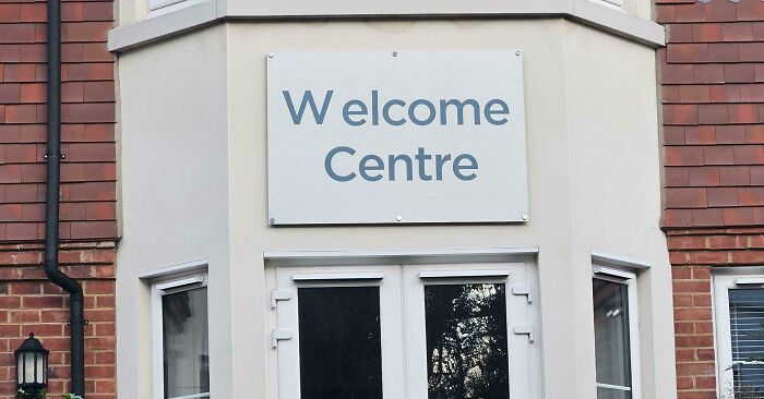
Image source: Ruby-Shark
#31 Kay Akkids
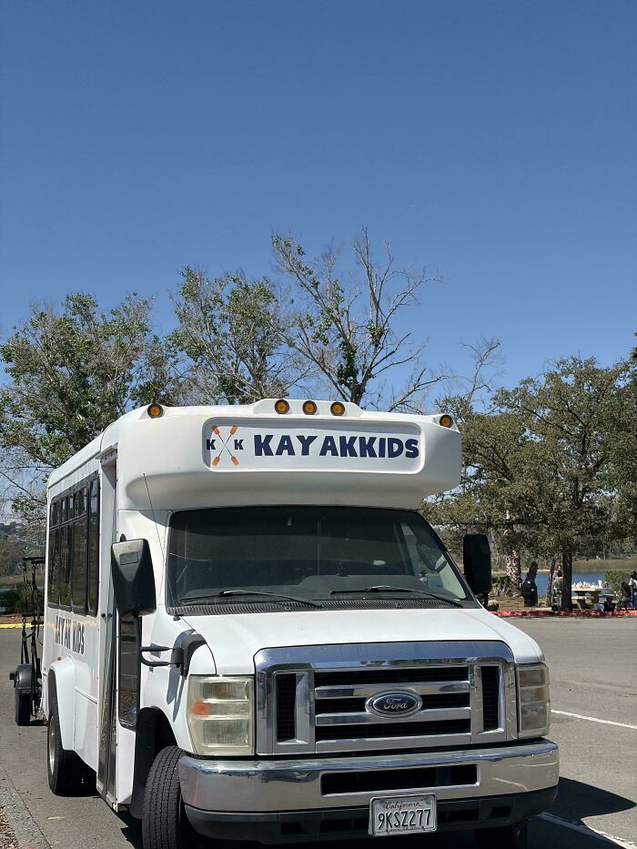
Image source: imalonenoyourenot
#32 M At He MA T Ic S
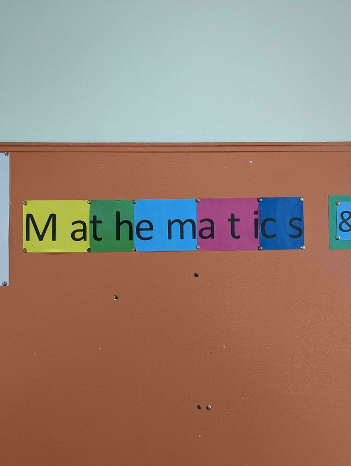
Image source: Inglan1
#33 This Waffle House Is Cosed
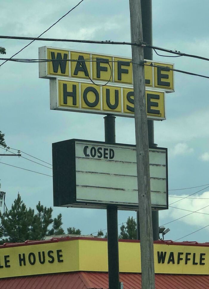
Image source: winja45
#34 Petarea
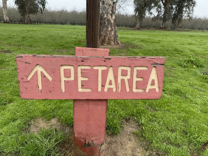
Image source: humourless_radfem
#35 Me R Cy Vintage
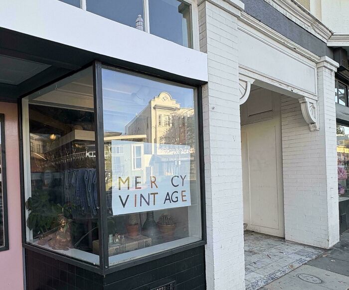
Image source: Gouchiano
#36 If The Mug Warmer Hots Urface, Ur Using It Wrong
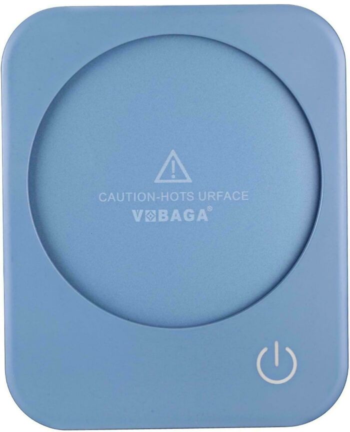
Image source: carsncode
#37 Who’s Tom Ercer?
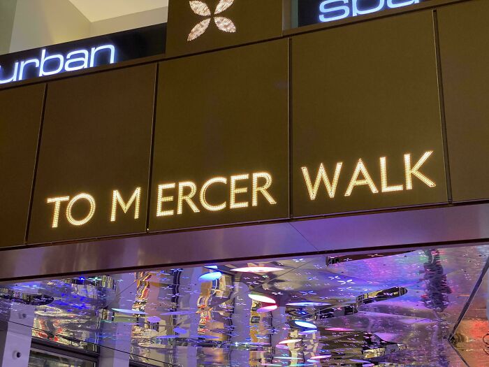
Image source: IrishMacgyver
#38 CA Sino
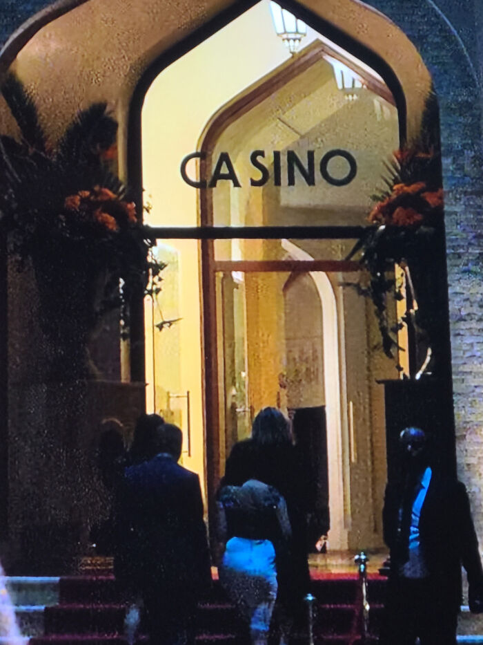
Image source: evshell18
#39 My Wife Is A Reading A Nov El
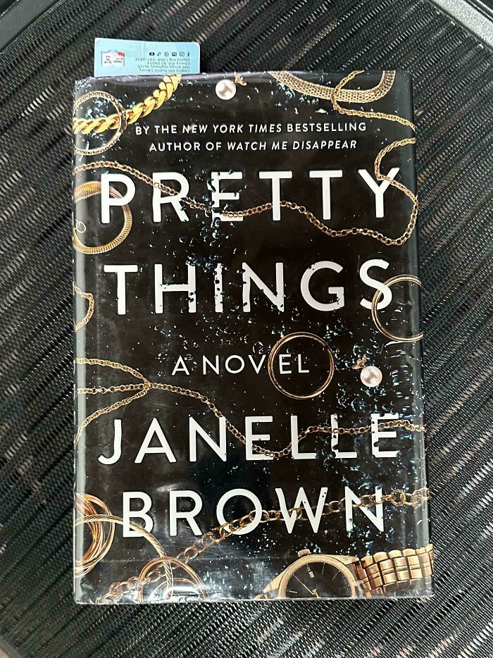
Image source: OMGLMAOWTF_com
#40 Do Not Overin Flate
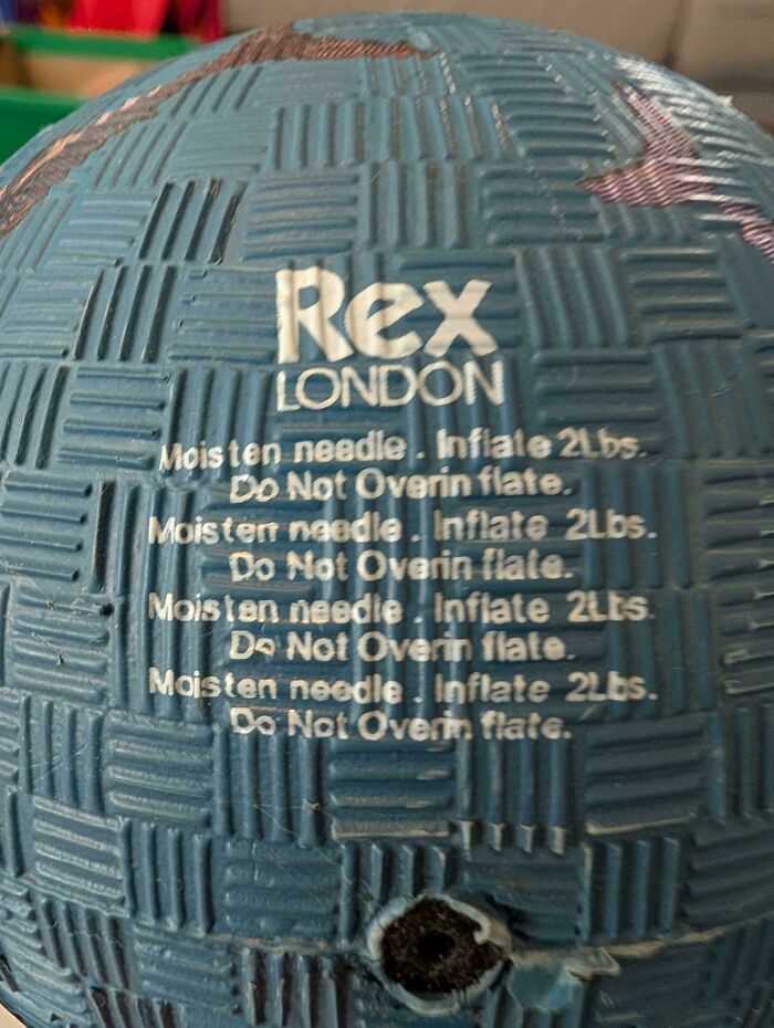
Image source: themaxmethod
#41 The Font At Work. I’ve Been Dealing With This For Nearly 23yr
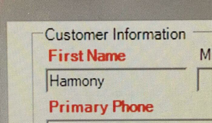
Image source: chadsmo
#42 Um Not Sure If This Belongs Here
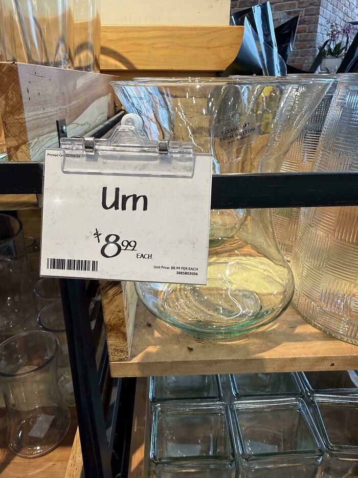
Image source: adamsdayoff
#43 This Sign At My Local Pharmacy Is An Abomination
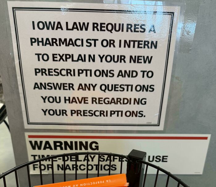
Image source: jcarr2184
#44 They Did Her Wrong
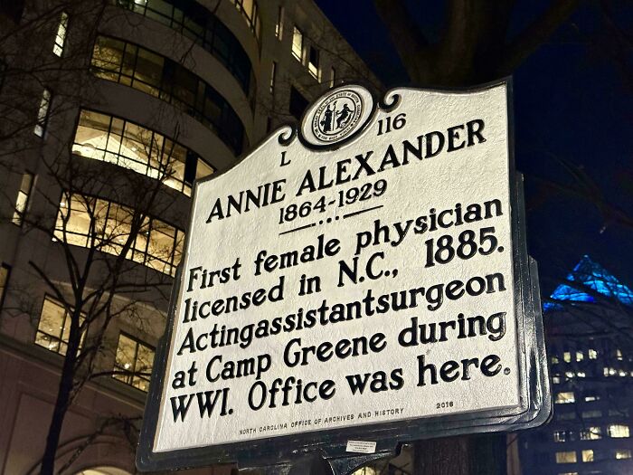
Image source: TenzoChris
#45 It Gets Better The Longer I Look At It
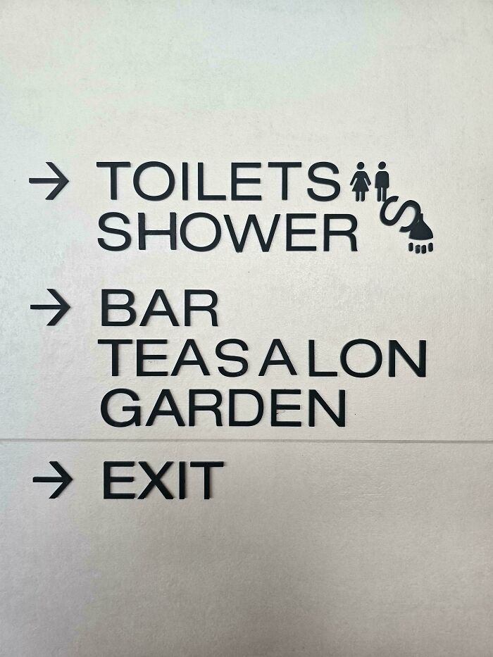
Image source: comeweintounity
#46 The Back Of A Staff’s Uniform At A Restaurant Called “Keming”
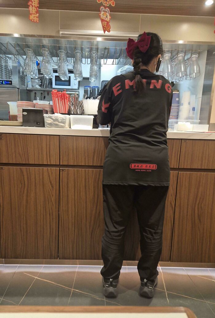
Image source: shin2112
#47 T He P Residential Walk Of Fame
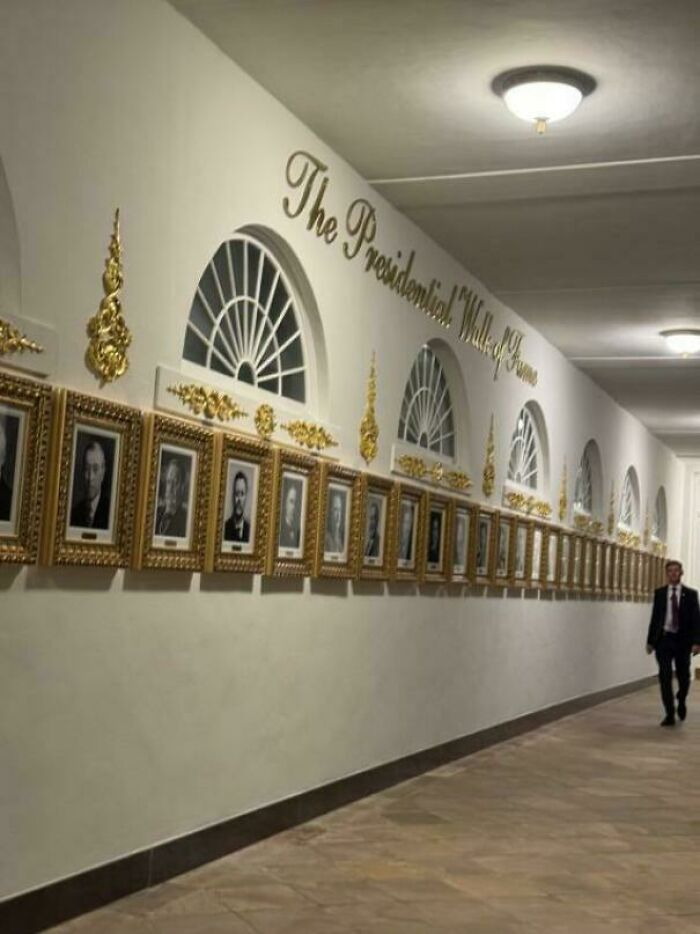
Image source: 33kbps
#48 My Leg Tattoo 😬
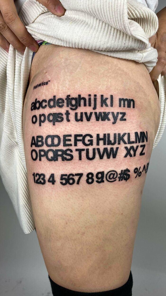
Image source: jad3dd
#49 Wild ⽇derflower
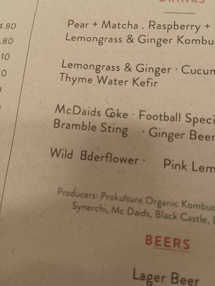
Image source: AmazinDood
#50 A Waming To All
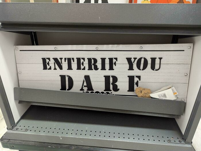
Image source: phirleh
#51 Ham
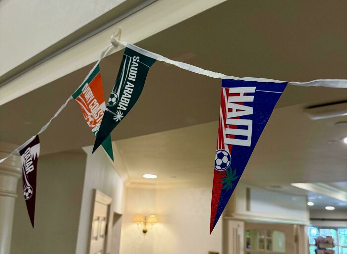
Image source: Jamnoggin
#52 I Visited Headquarters Today. Who The Heck Swiped The G?
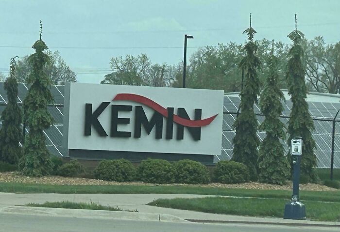
Image source: marrklarr
#53 Me Me Me Me
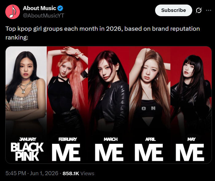
Image source: zapyrum
#54 Found In A Budget Shop In Romania
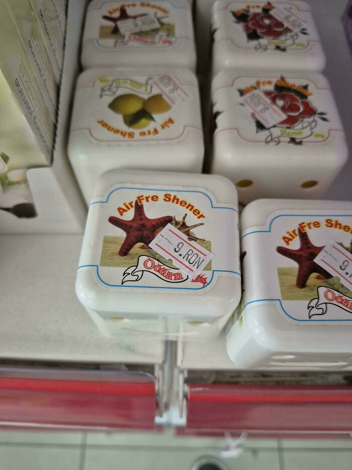
Image source: kloovt
#55 What Type Of Meat Is Dhuck?

Image source: ronin442
#56 Plattsburghintl.airport
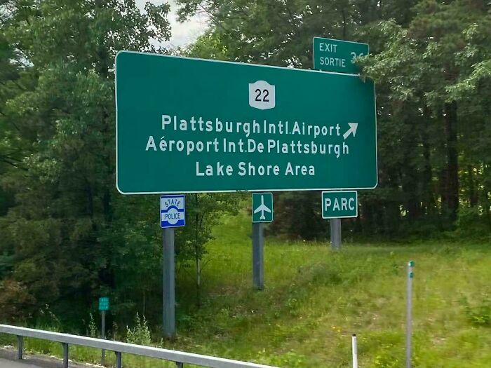
Image source: SanibelMan
#57 Libr AR Y
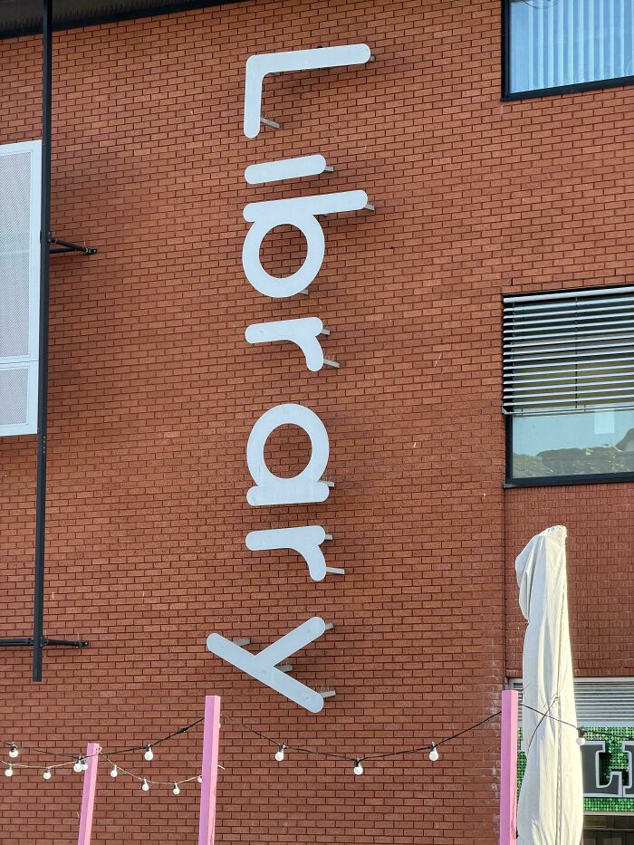
Image source: lynton123palmer
#58 Chillf Est Returns For A Second Year
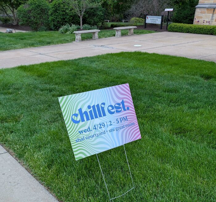
Image source: AccomplishedMess648
#59 Can’t Wait To Use This While Birdw Atching
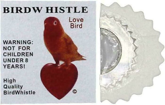
Image source: tani_P
#60 Why Is Ontario Kerned Differently?
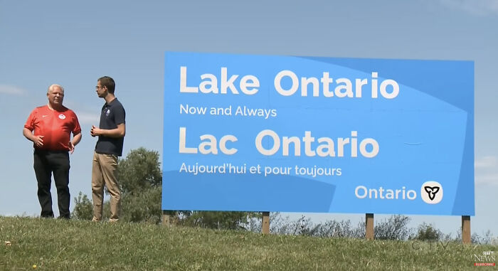
Image source: tayfife
#61 F O Ur T E E Nmile Creek
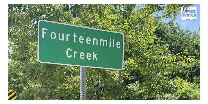
Image source: No_Cook2983
#62 The Number Spacing On This Wall Clock
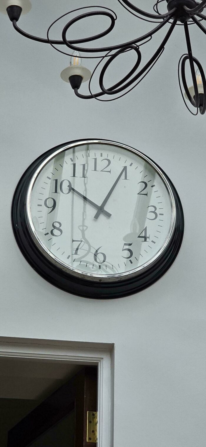
Image source: OnTheHorizon722
#63 Someone Messed Up The Spacing A Bit
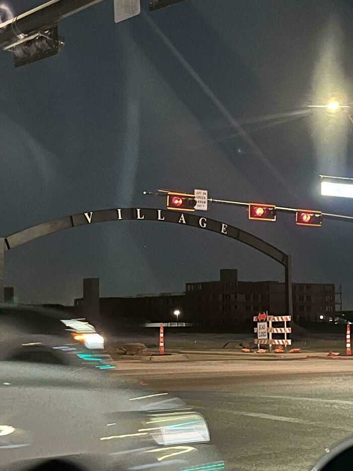
Image source: coding_apes
#64 Found One In The Wild. The Place Is Called Now Here Coffee
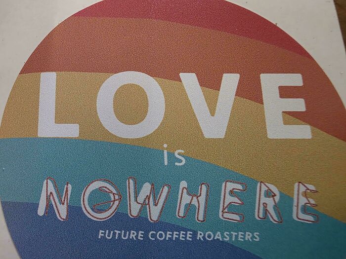
Image source: lollettone
#65 This Inspirational Sign In My Doctor’s Office Drives Me Crazy Every Time I Get To Number 7
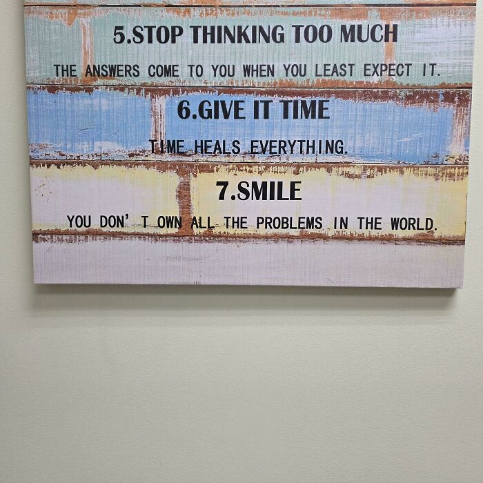
Image source: Severe_Atmosphere_44
#66 His Panic And La Tinx
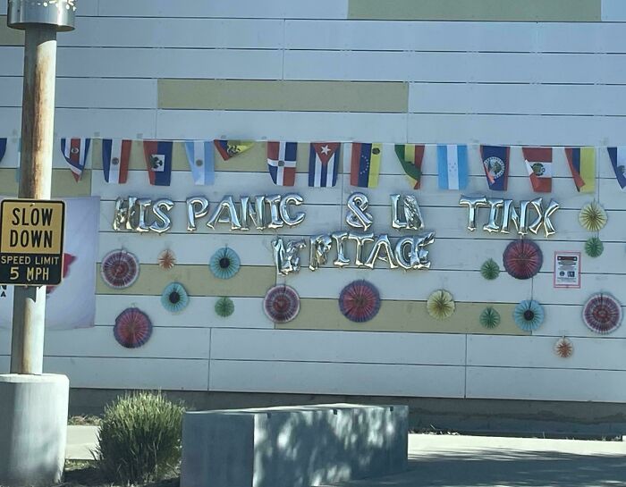
Image source: soundiego
 Follow Us