The symbol of the Batman has always been meant to strike fear into the hearts of criminals and for 70 plus years it’s been able to do that and more since it’s become a beacon of hope for a lot of people and something cool to look at for others. Over the years though it’s taken on a very different look with each new version of Batman as the dark knight has been depicted in many different ways and by several different men. Some definitely have their favorite looks but Sidney Fussell from Business Insider has pointed out it’s become a cultural icon that can’t really be disputed no matter what form it takes. Batman is Batman, there’s no denying that, and it seems as though every generation is going to have their version of Batman at this point since no one seems to be willing to let the dark knight rest entirely.
Here are a few things about the symbol you might not have known.
10. It’s gone through more changes than people realize.
Just looking at the chart above you get the feeling that it’s seen a few different touches throughout the years, and these are just the ideas that made it, not the ones that were scrapped because they weren’t just the way that the creators wanted them. Think about how many different ideas must have been tossed in the garbage can.

9. Some of the looks have been recycled and reused.
There’s really only so much you can do with this symbol before it starts getting out of hand or looking too clunky or too wispy. There’s a lot of variation that people might not see and there’s always the chance of putting in a new background or surrounding, but the symbol itself has been largely unchanged in its core form.
8. A lot of them have been used to fit the time period.
Nick Cannata-Bowman from the CheatSheet admits that the Batman logo has indeed changed a good deal over time, but usually to reflect the times since if you think about it the original logo wasn’t really taking into account what would happen decades down the line.
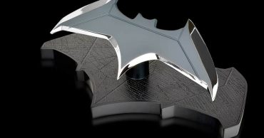
7. The yellow oval wasn’t used until the 60s.
Up until then and as of the 2000s the symbol was left all on its own to rest on Bruce’s chest. This yellow oval almost seemed like a target for criminals to aim for but it did mean something other than this and it was more than just a cool look.
6. The bat was based on more than just Bruce’s fear.
The story that a lot of us know at this point is that the bat was something that Bruce was afraid of and something he had to master his fear of in order to overcome and make himself stronger as he moved forward. But apparently the bat was also his ideal symbol for mankind’s continual battle against evil and the pursuit of purity and justice. How you get all that from a nocturnal creature that eats bugs and berries is something best left up to the writers.
5. The Batman vs. Superman logo was symbolic.
The whole logo within a logo idea was meant to symbolize two heroes coming together even if for much of the movie Batman was looking to undermine and then even kill Superman because he represented a very insane level of threat to the world he’d come to live upon. Following their team-up however it became obvious that the symbol was meant to be a unifying brand that would inspire people in a way.
4. The original logo was meant to signify a man wearing a cape.
It was big, it was clunky, and it was one of those symbols that seemed as though it lacked a little bit of imagination but also didn’t figure on a guy wearing body armor. Back then it was all about the suit and cape, not much else.
3. The symbol has gone through a few color changes in the movies.
Obviously the symbol itself has remained a pretty uniform black most of the time, though it did get a silvery makeover in Batman and Robin when George Clooney took the helm, which was gone by the time the next movie rolled around since everyone was trying hard to forget those days.
2. If you’ll notice the symbol on his chest almost never matches the symbol in the sky.
Some people might like to argue over this but it’s kind of true that the symbol in the sky is a little more rudimentary at times, especially in the live-action movies. In the cartoon it’s a little easier to match the symbols since drawing something as opposed to fabricating it seems to go a bit smoother.
1. Obviously some of the designs were non-starters and were quickly scrapped.
There have been a lot more logo designs than you see above and they were all put to use at one point and time. But some didn’t last all that long since the design was deemed less than effective and was replaced quickly.
However you want to see it, the Batman logo has for a long time been a symbol of justice in one way or another.
 Follow Us