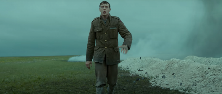
credit: 1917
1917 is a war film, released in December 2019, which was heavily inspired by World War I Operation Alberich, or Unternehmen Alberich, as it was called in German. During the said operation, the German forces abandoned two of their salients in Northern France for a better position behind the Hindenburg line (called Siegfriedstellung in German). The titular year was when the widely known retreat operation happened.
The movie had quite an easy-to-follow plot line. Our main characters, William Schofield and Tom Blake, who were both lance corporals, were sent out by General Erinmore to deliver a message to the Colonel of the 2nd Battalion of the Devonshire Regiment, Colonel Mackenzie. The message was the General ordering a halt in attack because the Germans had heavily invested in their defensive line and were ready to slaughter all British soldiers once they went in the assault. If the two lance corporals failed to deliver the message, it would be a “massacre” (in Erinmore’s own words).
While the storyline of 1917 was quite simple – delivering the message and preventing slaughter, commentaries on that would be a story for another day. For now, we will be talking about the visual elements of the movie, which was also greatly appreciateds.
1917’s Use of Color
Unlike those historical movies that we were told to watch in school at some point, 1917 had vivid and vibrant color, following the move of the historical movies that preceded it like Dunkirk (2017) and Der Untergang (2004).
Why was color important? Not only did it give the plot added weight, but the play on visual aesthetics also helped sell the danger and urgency the film needed conveyed. It also gave the viewers an actual representation of what the scene looked like.
Movies with plain, monochromatic color schemes tend to create an inaccurate and often limiting depiction of reality. They also always remind the audience that the story was taking place in a different time, taking the viewer out of the immersive experience. Should movies with monochromatic color schemes gain prominence once more, we would fail to fully understand and appreciate what things looked like to those who lived in the past.
1917 gave us a glimpse of what Operation Alberich looked like on the British Side. It showed how sweltering the weather is, how damp the swamps were, and how dirty the trenches were – something we would fail to see in a typical war movie.
credit: 1917
Lighting
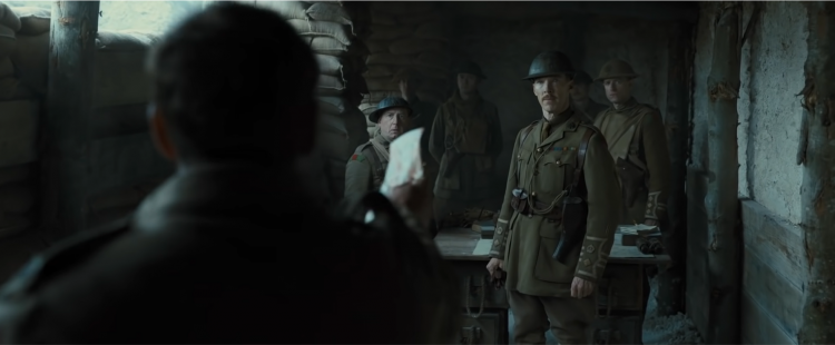
Lights were hard to employ in the scenes of 1917 unless the scenes were completely in the dark. This gives off the idea that in war, there was no artificial lighting in broad daylight. Because of the minimal lighting, the viewers were given the idea of how things looked on the battlefield, without unnecessary modifications.
Lighting was hard to install in the shooting of the film because the camera had to follow wherever the characters went. After all, Director Sam Mendes, was committed to making the movie look like one long take.
credit: 1917
Shots
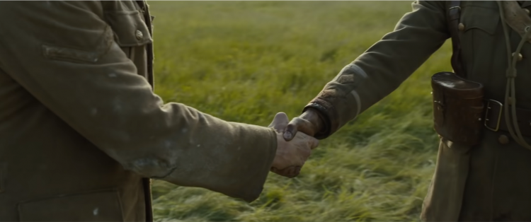
And finally, we have the fan favorite visual aspect of the film, the shots. The movie seemed to be a movie in one long shot, or a movie with, maybe two or three shots woven together.
1917 movie wanted its viewers to be the spectators of the war. It wanted fans to live the experience of being on the battlefield without being shot at. Through this one-shot style, we were given the feeling of being immersed in the story, it was almost as if we were there and just walking back if ever the characters were moving towards us. When characters were talking, the camera moves instead of cutting to another angle to make the talking party visible. The camera simply changes its focus to track the change of scene, as if following the characters when moving.
It also underlined the continuity of war, that there were no pauses and cuts in war, and it was a completely fast-paced random scenario that require fast actions.Dunkirk (2017)
 Follow Us
