Most things go through a few drafts, for good reason. In a similar vein, proofreaders will often get a second set of eyes on some project. However, there are some folks in charge out there who feel that one and done is all it takes and are pretty insistent that their ideas work despite, well, the mountain range of evidence to the contrary.
So we’ve gathered some of the worst design fails from across the internet to make you feel a bit better about your own not-so-successful attempts at making something. Get comfortable as you scroll through, upvote your favorites and be sure to share your own thoughts and stories in the comments below.
#1 He||c, It’s Me
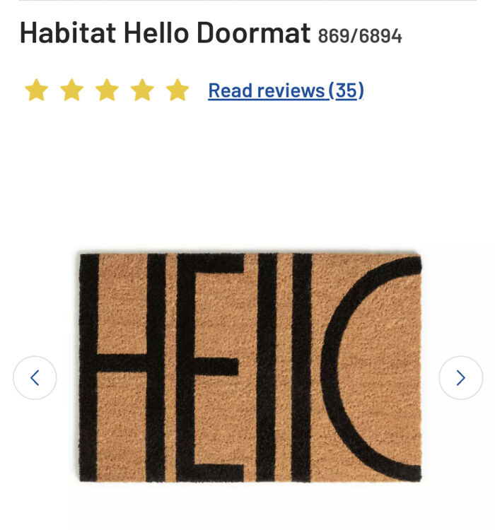
Image source: LolaFrisbeePirate

#2 Finally The Colour Hues Of My ‘Loo’ Is Taken Care Of. Thanks Apple !!!
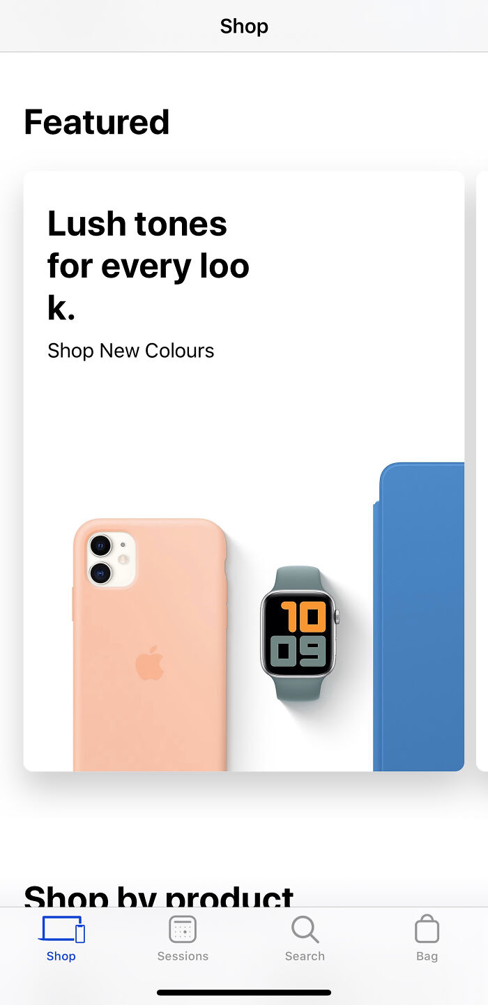
Image source: bluecapella
#3 This “Website”
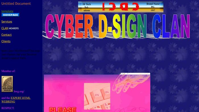
Image source: Extreme-Fee
The humor in bad design boils down to something surprisingly deep. Psychologists (or at least Germans) call it schadenfreude, that little spark of pleasure we get from watching someone else’s misfortune, the often referenced schadenfreude, it often shows up strongest when the mistake feels like it was avoidable or self-inflicted.
A door handle installed upside down or a crosswalk sign pointing directly into a wall doesn’t just make us laugh, it makes us feel a tiny bit smug, like surely we would have caught that. Of course most of us wouldn’t have, but that’s beside the point. The appeal isn’t cruelty so much as recognition. We’ve all stared blankly at a shower handle wondering which direction means hot, and seeing that confusion turned into a viral photo makes the whole shared human experience of being baffled by objects feel a little less lonely.
#4 Business Card That Was Handed To Gordon Ramsay On Hotel Hell
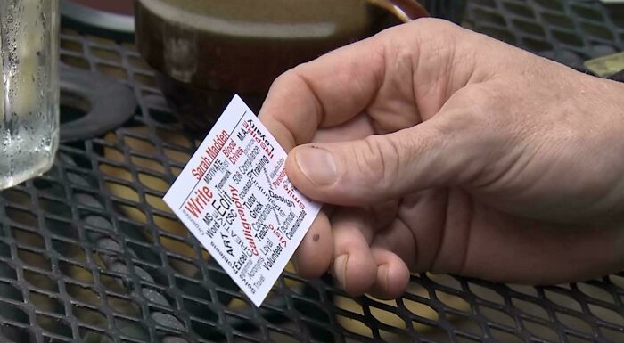
Image source: Potato_Stains
#5 I Literally Found This And Have Nothing To Say Except… You Had One Job
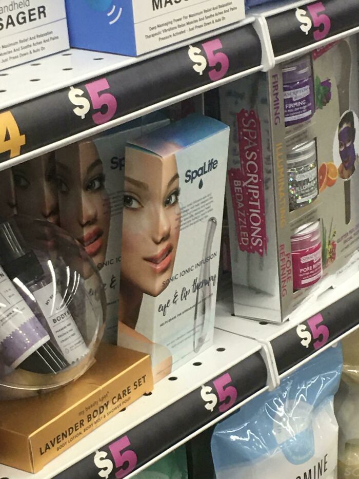
Image source: [deleted]
#6 This Mirror At The Resort Im Staying At
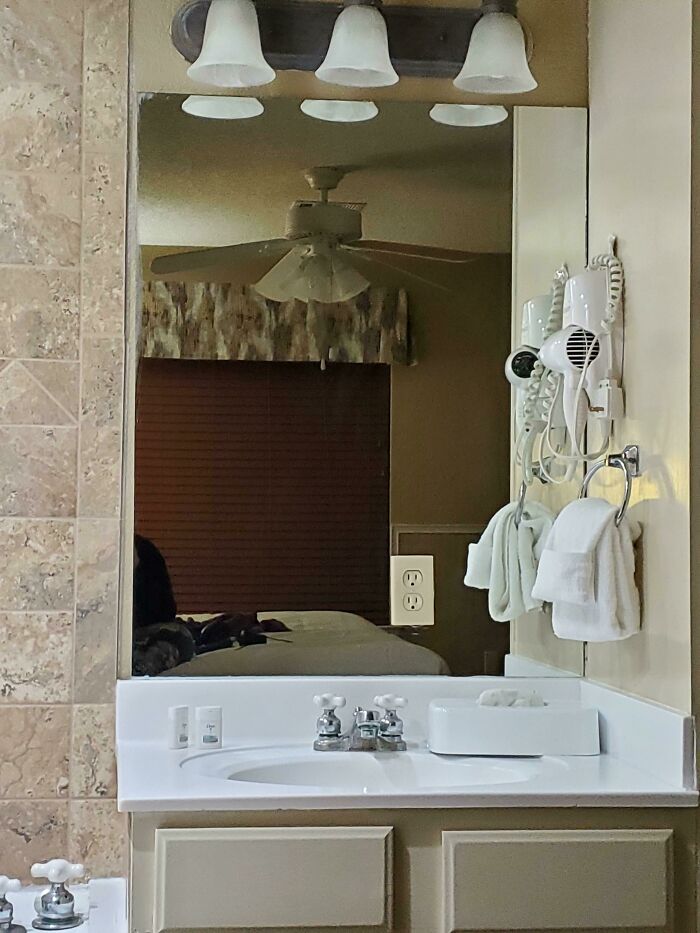
Image source: JestARandomBIGirl
There’s also a satisfying sense of justice tucked into these posts. Somewhere out there, a person got paid to design a parking sign, a menu, or a building entrance, and somehow ended up creating something that actively works against the people using it. When that gets exposed and mocked online, it scratches an itch related to fairness and accountability, the same itch that makes us enjoy watching overconfident people get humbled.
#7 We Have Spongebob At Home
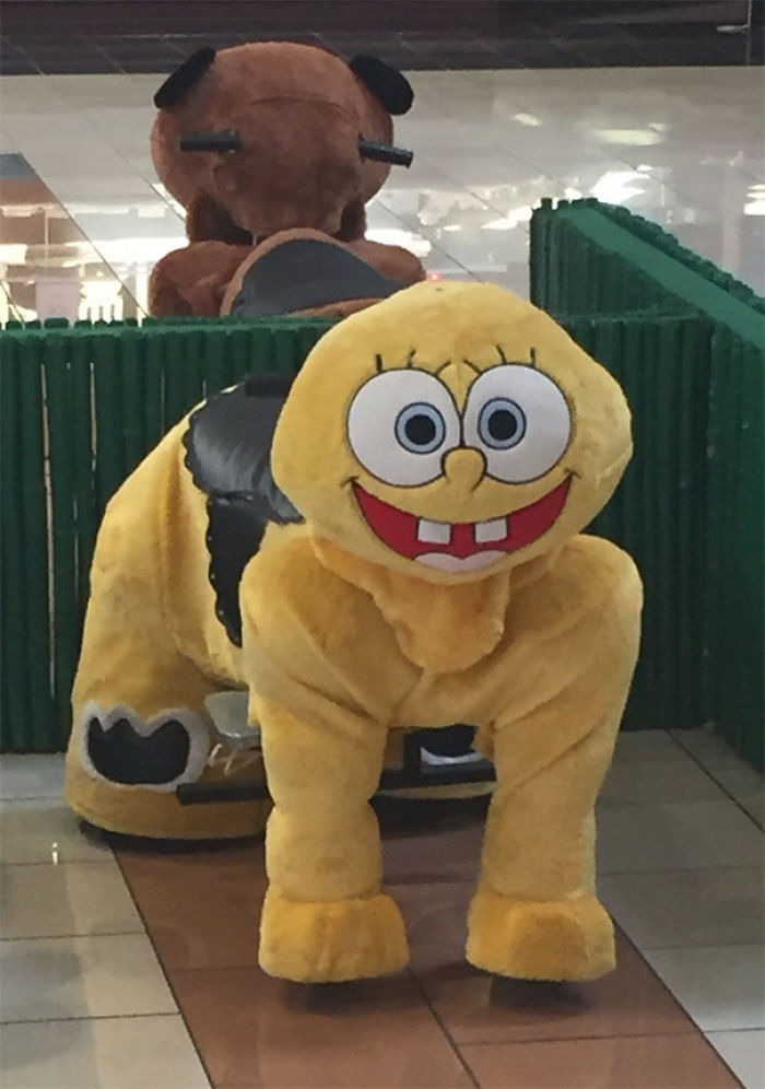
Image source: https://x.com/Cursed_Merch
#8 Language
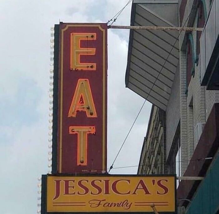
Image source: [deleted]
#9 Dream Job
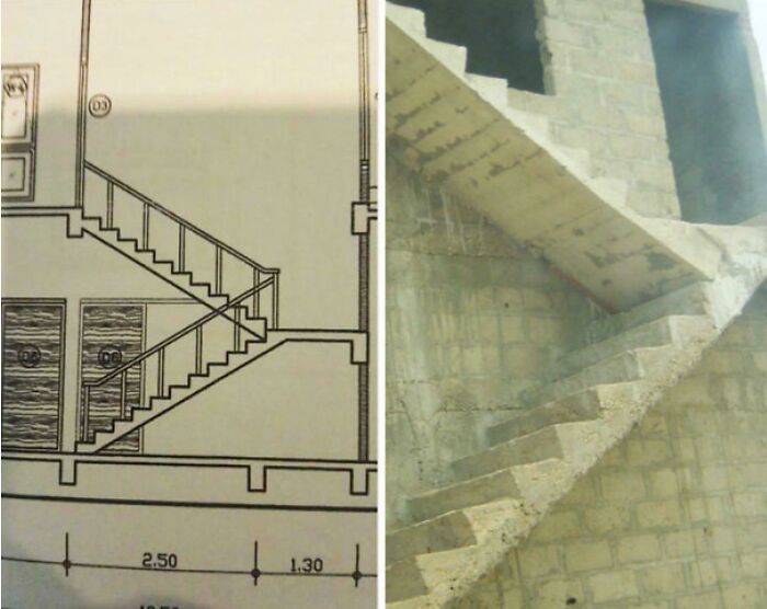
Image source: [deleted]
Nobody actually gets hurt by a poorly placed light switch, which keeps the whole thing squarely in the realm of harmless fun rather than mean spirited ridicule. So what actually makes design bad in the first place? Cognitive scientist Don Norman spent decades studying exactly this, and his book on the subject basically argues that good design should be invisible.
#10 Holopeve
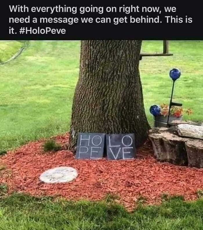
Image source: bozoskeleton
#11 This Glorious “Flavor Note” Of Pinot Grigio
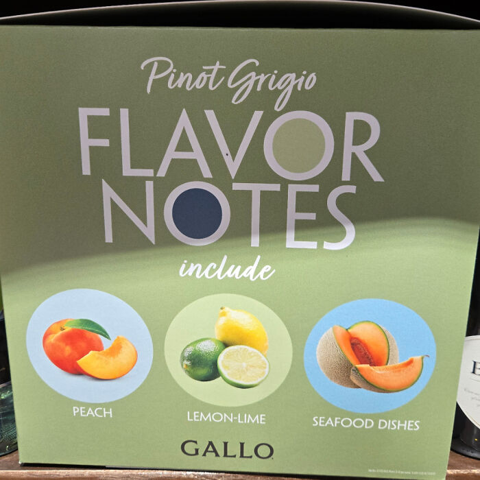
Image source: DarkSea719
#12 Uhhhhh
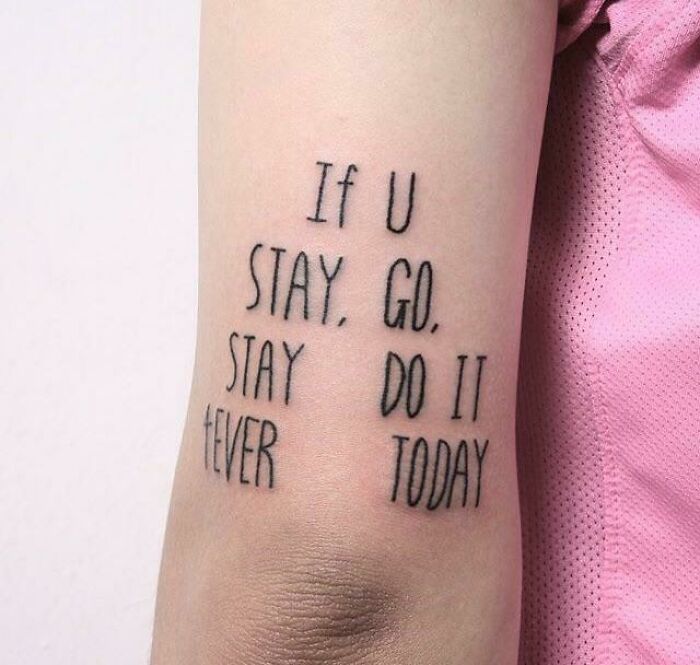
Image source: Harambeslastwish
When something works the way your brain expects it to, you don’t even notice the design at all, you just glide through the task. Norman argued that when people struggle to use an everyday object, it is almost never their fault. It’s the object’s fault for failing to communicate clearly how it’s supposed to work. His most famous example is the humble door that gets pushed when it should be pulled, now nicknamed a Norman door in his honor, and once you learn the term you will never stop noticing them.
#13 It’s Only $8400
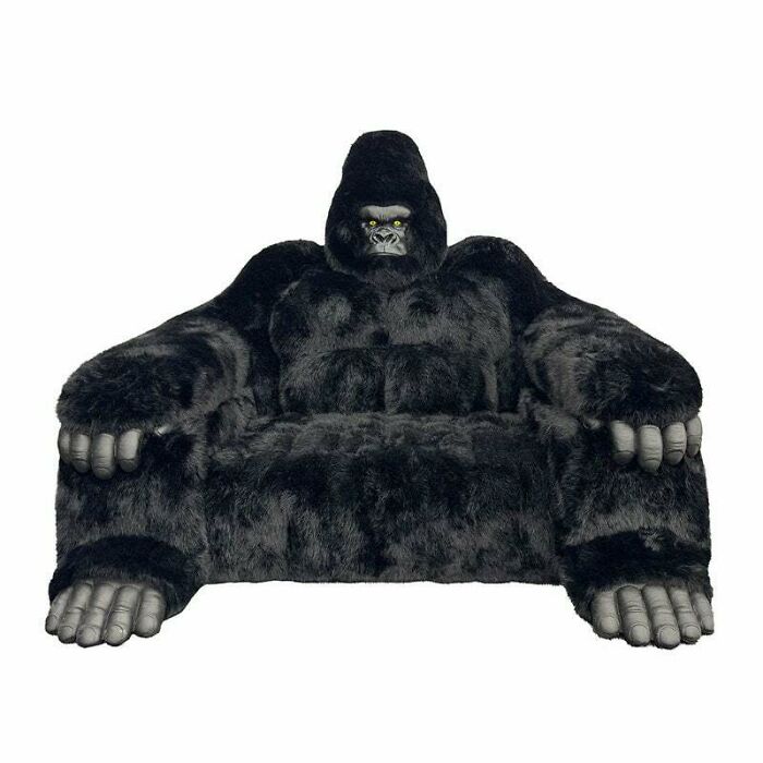
Image source: bozoskeleton
#14 This Vendor’s Website Kind Of Failed
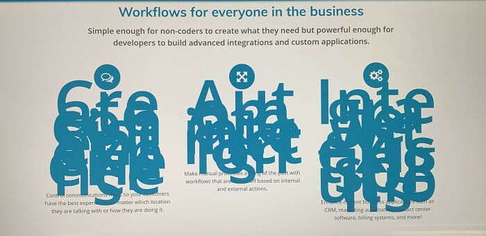
Image source: koreanforrabbit
#15 Sample Text Here
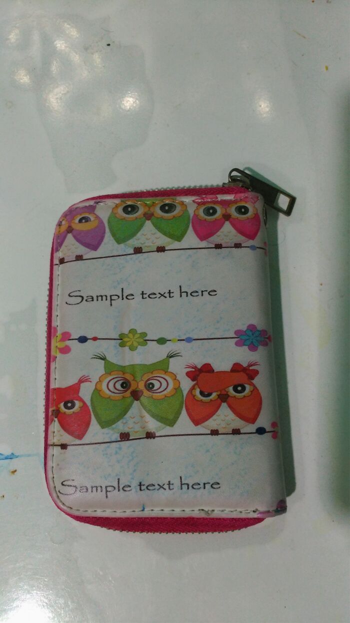
Image source: Langobse
Bad design tends to share a few consistent traits. It ignores how people actually behave in favor of how a designer imagines they should behave. It buries obvious functions under decorative nonsense. It gives no feedback, so users have no idea whether their click, tap, or push actually did anything.
#16 Beautiful Plating..wait What?
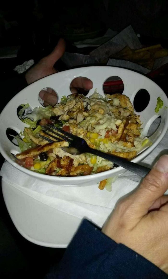
Image source: [deleted]
#17 Habirt Ppyhday!!!
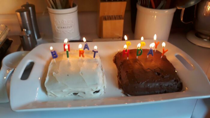
Image source: sewitsew
#18 “Lets Hang Out Together”
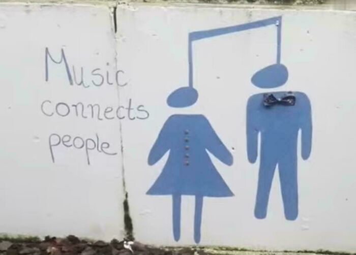
Image source: RealDaBaby416
Usability researchers at the Nielsen Norman Group have spent years cataloging these patterns into a widely used set of principles, and as outlined on their site, things like visibility, consistency, and error prevention show up again and again as the difference between something that feels effortless and something that makes you want to throw your phone across the room. When a form asks you to enter a date in three different formats depending on which screen you’re on, that’s not a small inconvenience, it’s a full heuristic violation dressed up as a minor annoyance.
#19 Everything About This Menu Triggers Me
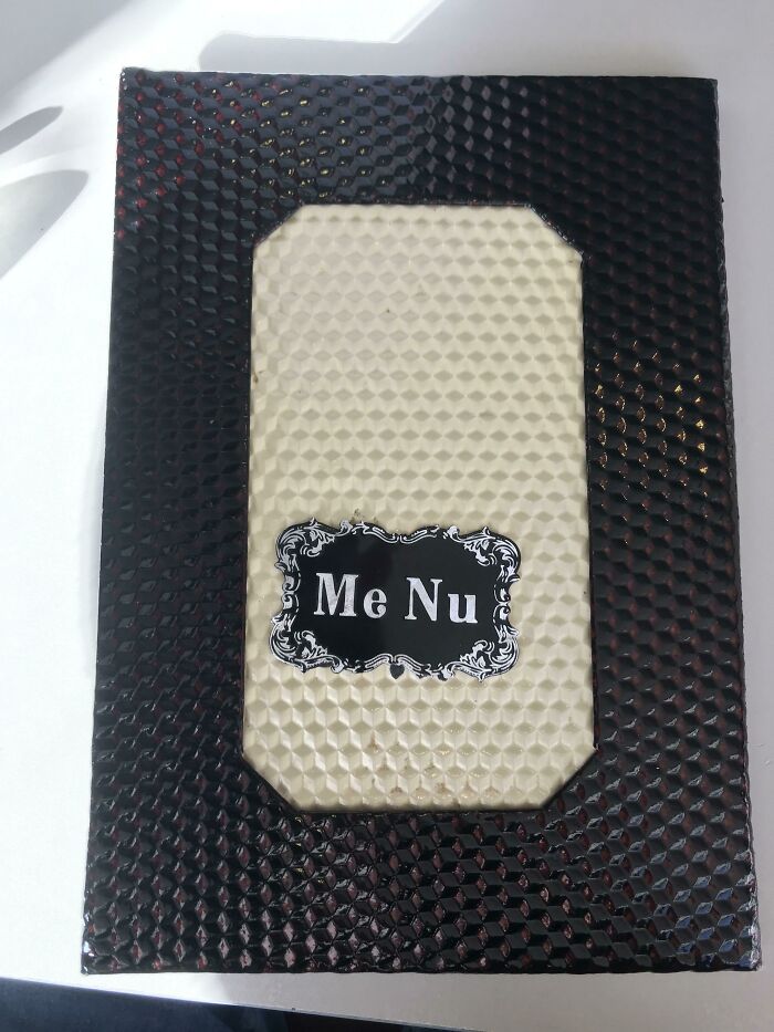
Image source: Zardashtbaran
#20 The Tokyo Subway Map Has… Legibility Issues
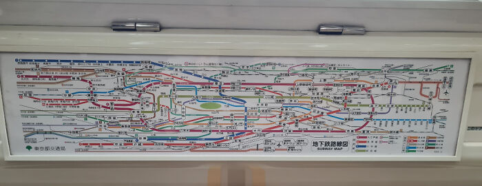
Image source: themediumdane
#21 This Wheelchair Ramp In The Philippines
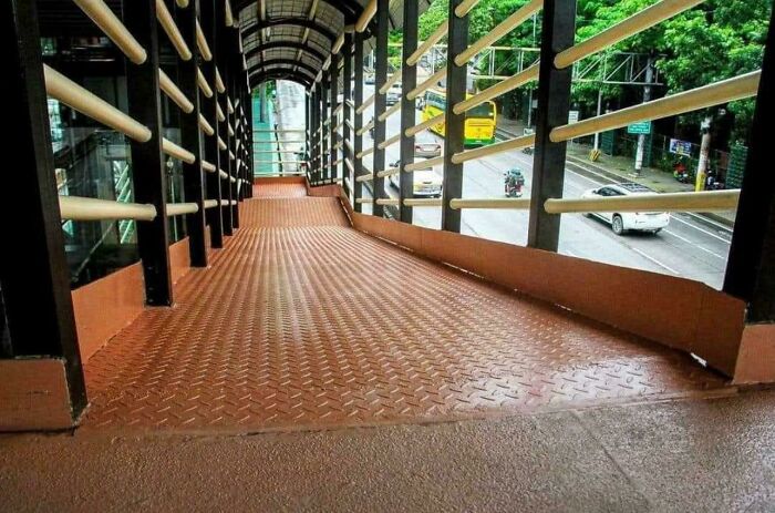
Image source: okwolf6705
What makes these fails so shareable, though, is that most of them aren’t hidden in some technical backend nobody sees. They’re staring you right in the face on a staircase, a bathroom door, or a poorly cropped billboard. Visual absurdity travels fast because you don’t need any special expertise to spot it.
#22 Whose Hand Is That??
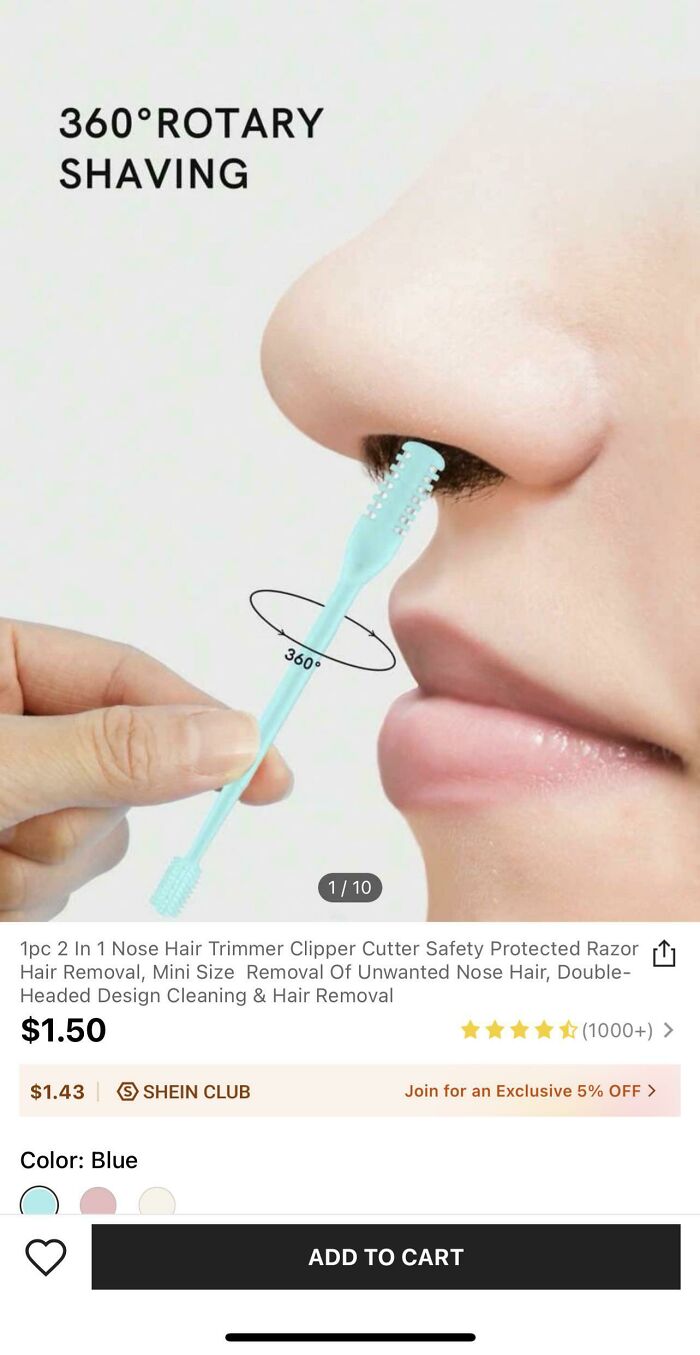
Image source: limenitisarthemis901
#23 Hear Of Texas
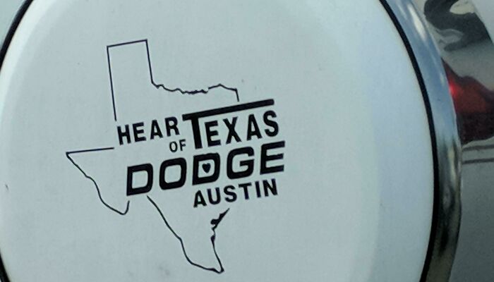
Image source: slackjohn
#24 My Pool Is 7 Feft Deep Operantly
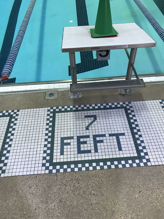
Image source: 300_Black0ut
Anyone can look at a bench installed facing a brick wall and understand, instantly and completely, that a mistake was made somewhere between the blueprint and the concrete. That universal readability is exactly why these posts keep spreading and why scrolling through a pile of them feels less like judging strangers and more like bonding with everyone else who has ever stared at a confusing object and thought, who approved this.
#25 Nice Alignment Here
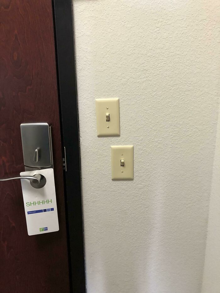
Image source: Travl2Much
#26 Why?
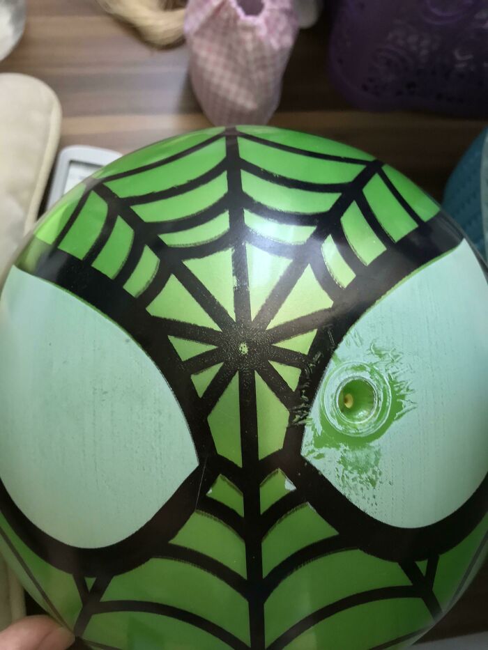
Image source: alihandrox
#27 Tastefully Colored Sidelines On A Basketball Court
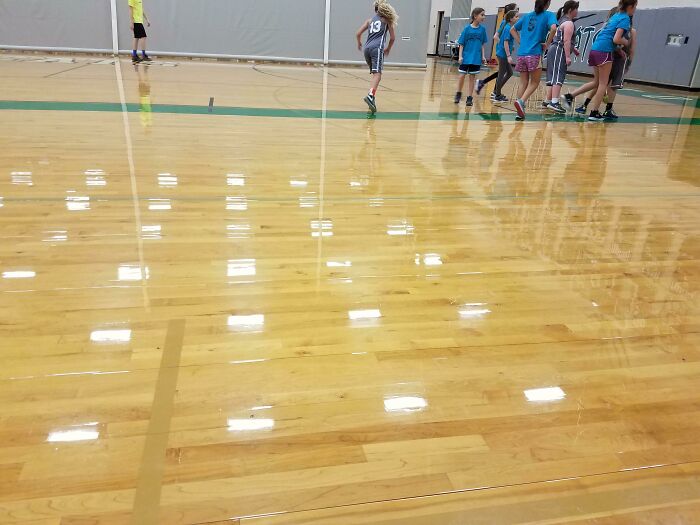
Image source: NoLikeTrump
#28 Why Do 99% Of Firework Packages Look So Poorly Designed, As If Someone Was Trying To Shove In As Many Photo Effects As Possible
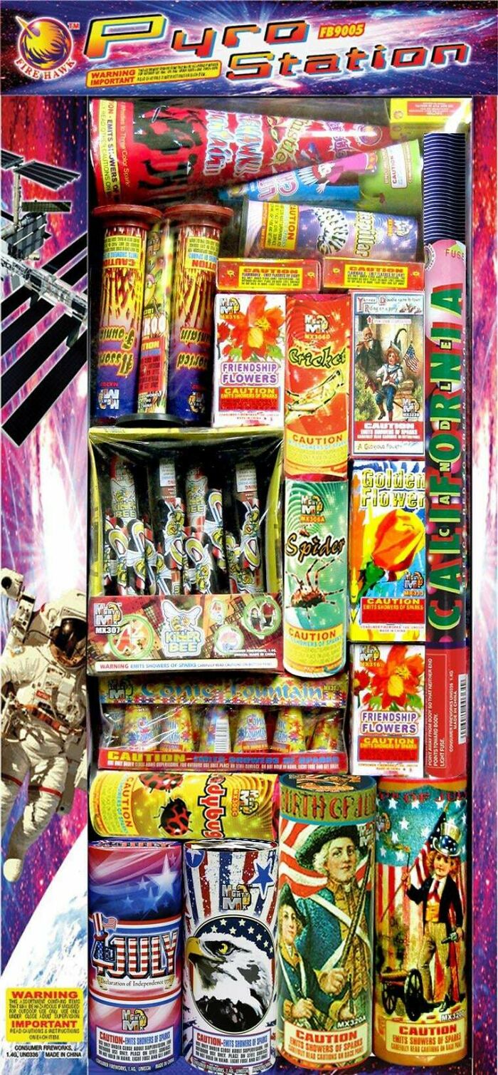
Image source: Extreme-Fee
#29 This Hurts The Soul
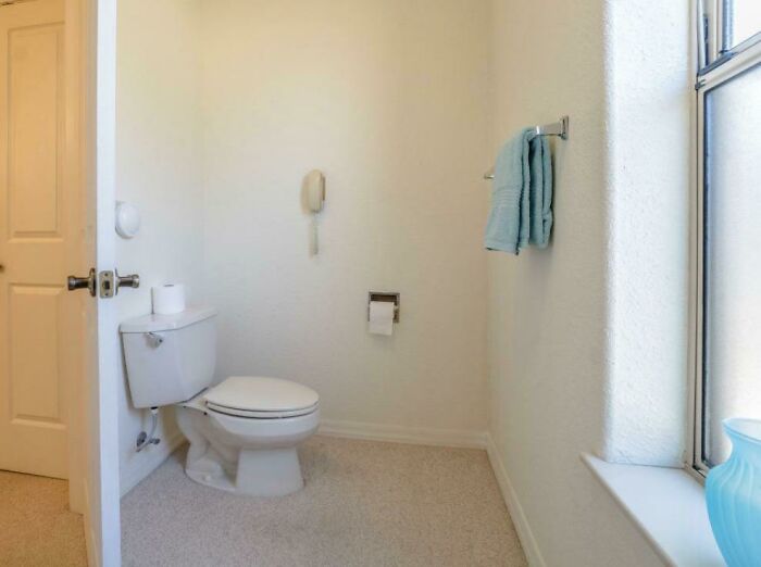
Image source: mersonstail
#30 Feat Ures
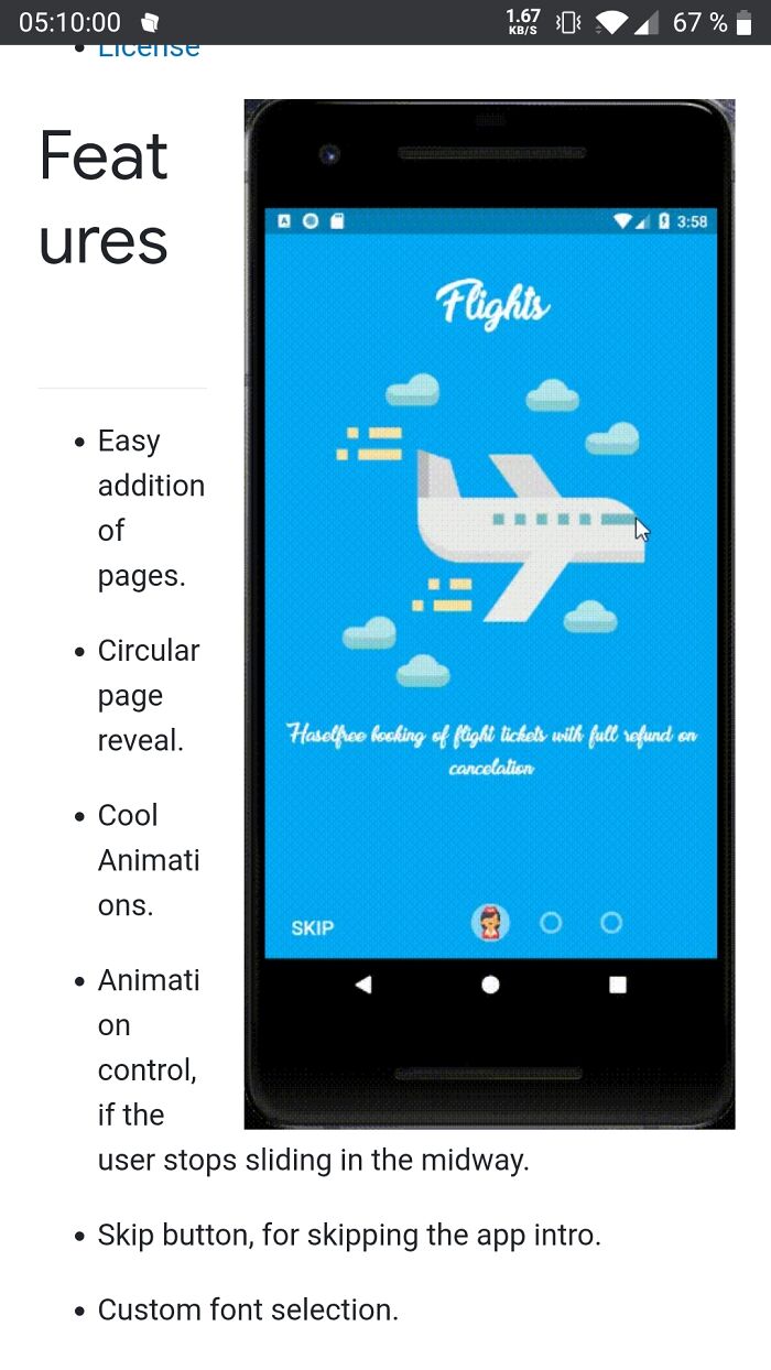
Image source: Jaymobie
#31 Inser Company Logo Here
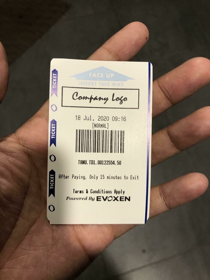
Image source: NotTheKyrie
#32 I’m Filing For Benefits After These Va Email Color Schemes Ruined My Eyes
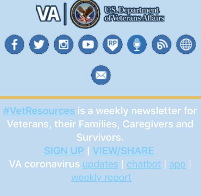
Image source: [deleted]
#33 That Apostrophe
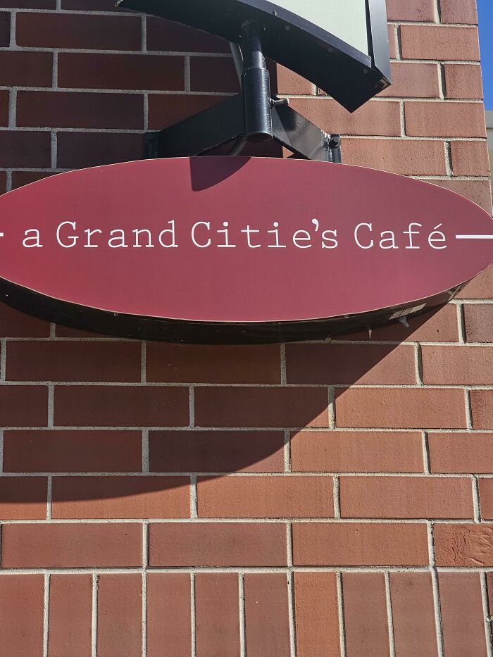
Image source: shhh_DadIsOnACall
#34 Why Is Every Hotel Trying To Reinvent Shower Controls
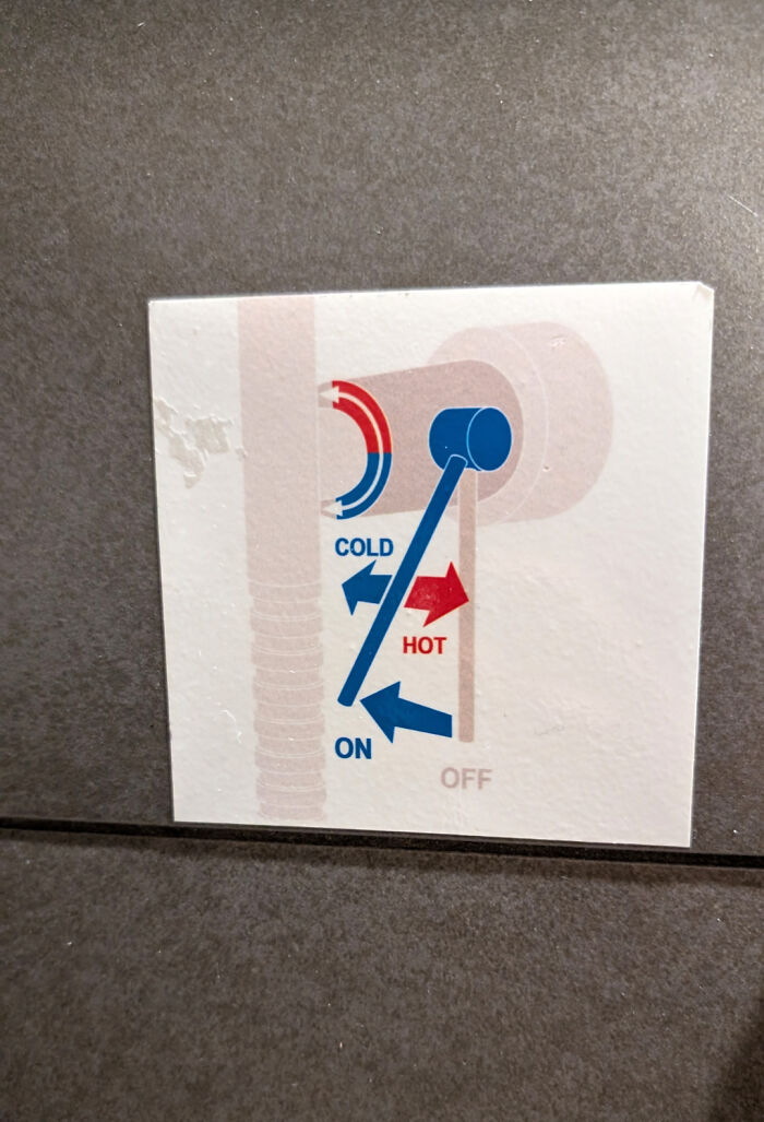
Image source: koreanforrabbit
#35 Someone Suggested I Should Post This Here
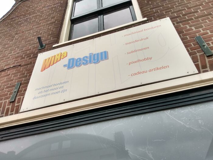
Image source: holyelmo_
#36 Why The Colors?
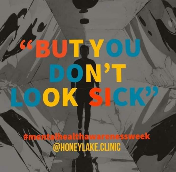
Image source: Redheadedmb
#37 My Local Newspaper
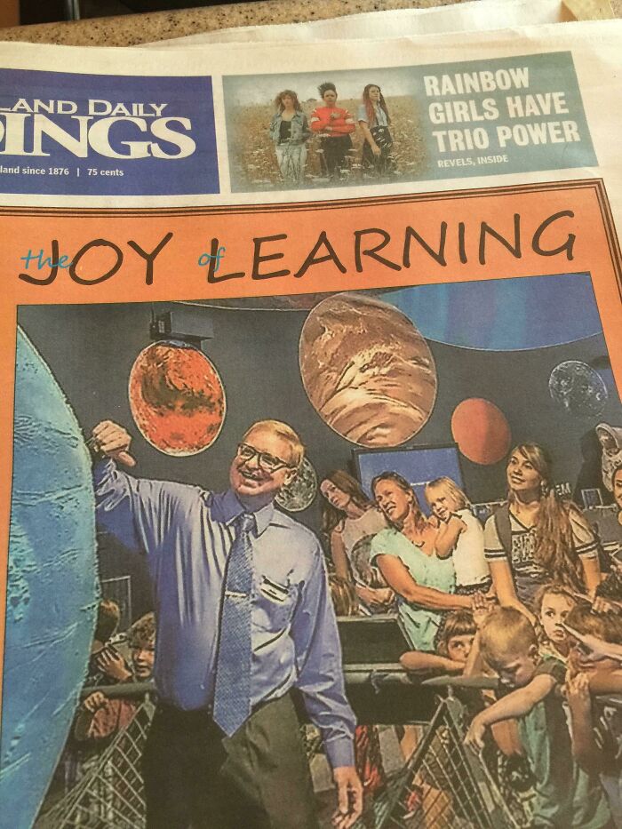
Image source: [deleted]
#38 Woof
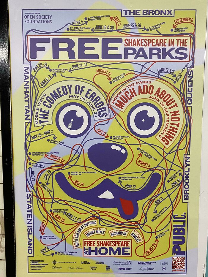
Image source: [deleted]
#39 This Harvey’s Sippy Lid – Has A Hole To Drink From And Another One To The Left That Pots Your Drink All Over Your Lap!
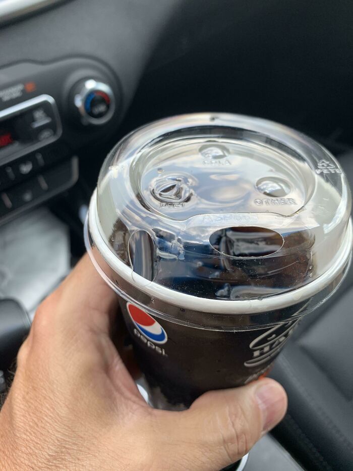
Image source: iambf999
#40 Look At This Volume Button
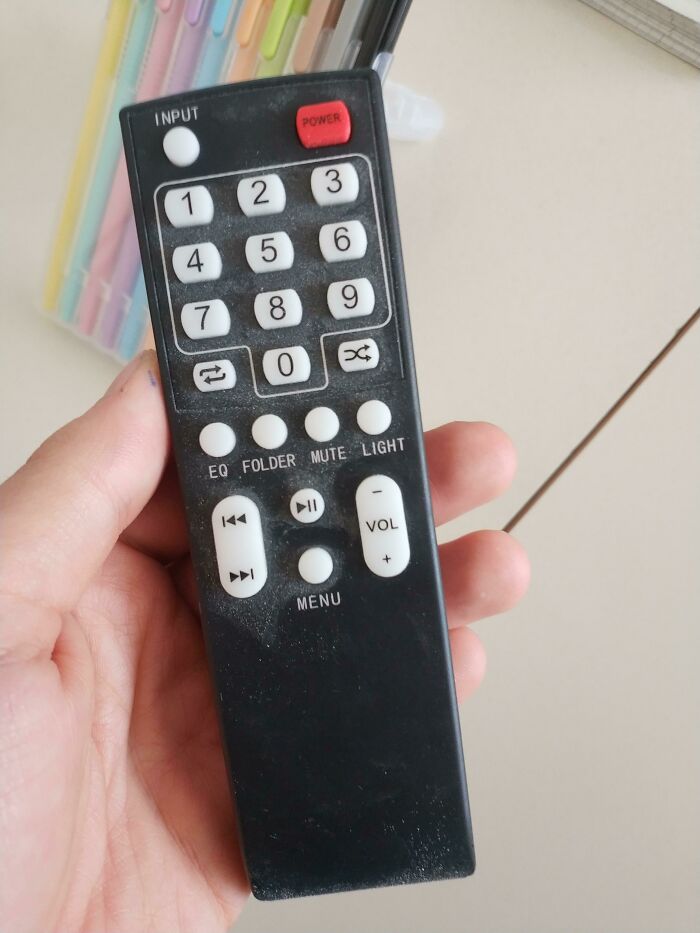
Image source: alessandroias
#41 The Sign Was Not In Braille
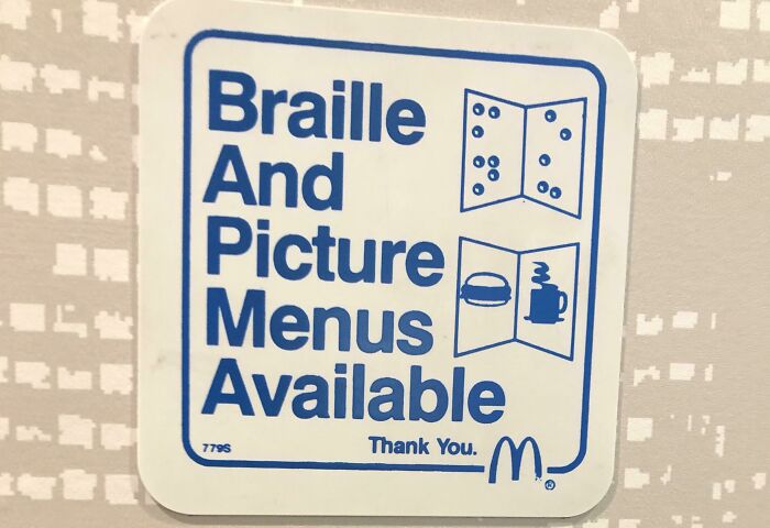
Image source: rasalghularz
#42 Hmmmm, Which One Should I Use?
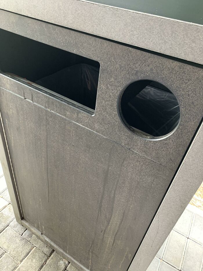
Image source: foxpoison00
#43 This Doge Backpack
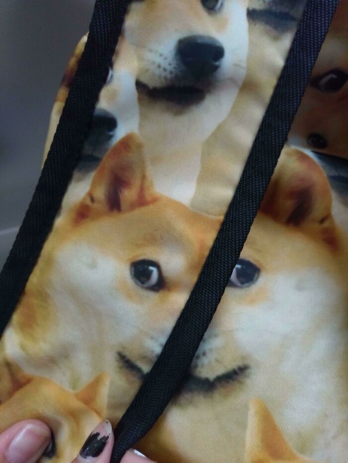
Image source: Le_Lucario_Boi
#44 Traffic Light And A Post
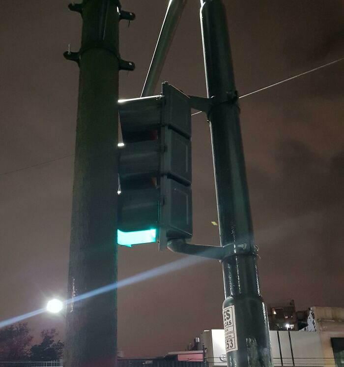
Image source: camenes
#45 White Clock White Numbers
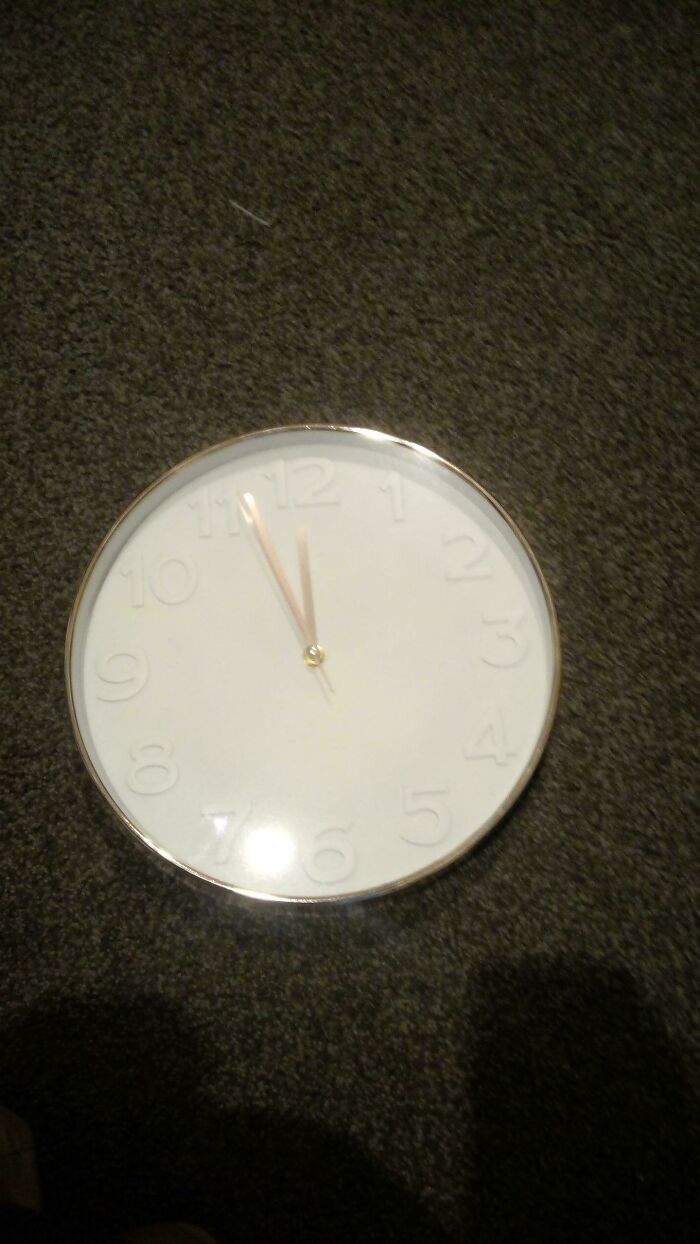
Image source: big-nose-leka
#46 Wendy’s Drive-Thru?
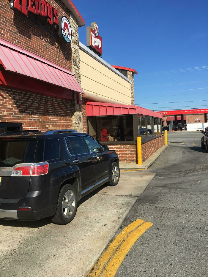
Image source: MrRSTEELE
#47 Let’s Make A Bottle Opener That’s Hard To Use, Hard To Hold, And Uses Twice The Materials!
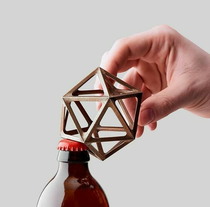
Image source: Zoomwafflez
#48 My Sisters Wire Straightener
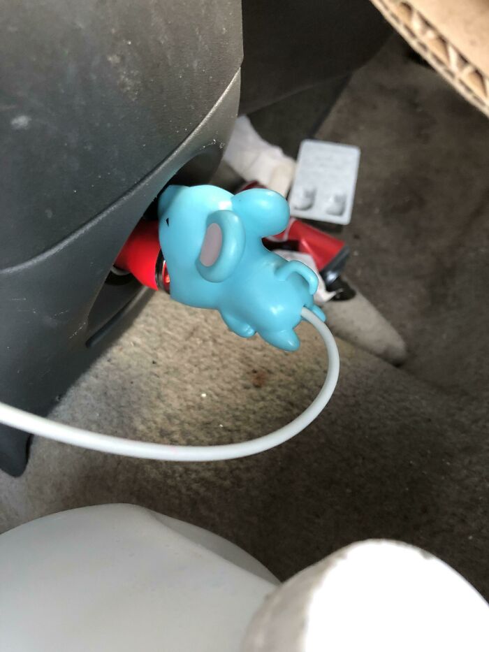
Image source: phoenix_killa87
#49 velcome
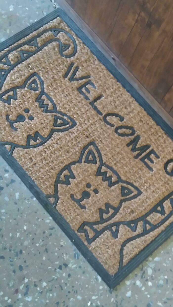
Image source: RainisTheCat
#50 Window Right Next To The Shower
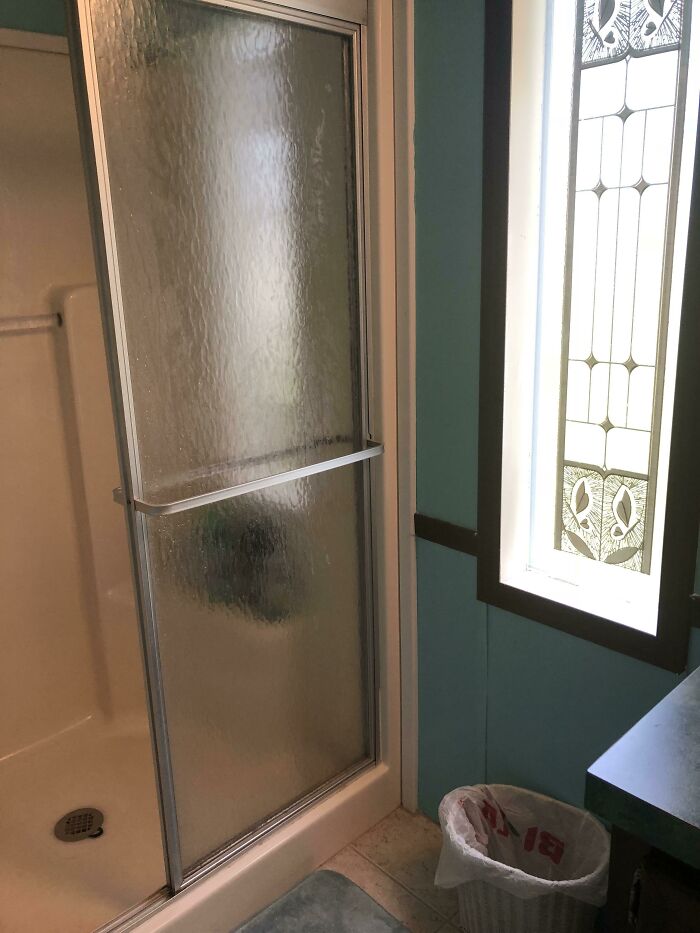
Image source: saturndatboi
#51 I Had To Hack It To Make It Work
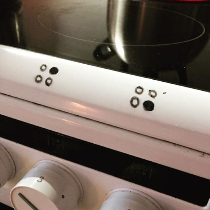
Image source: pm_me_your_lat_long
#52 The Kerning On This One Made Me Throw Up
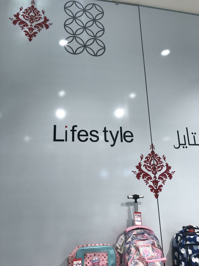
Image source: Zardashtbaran
#53 The Irony
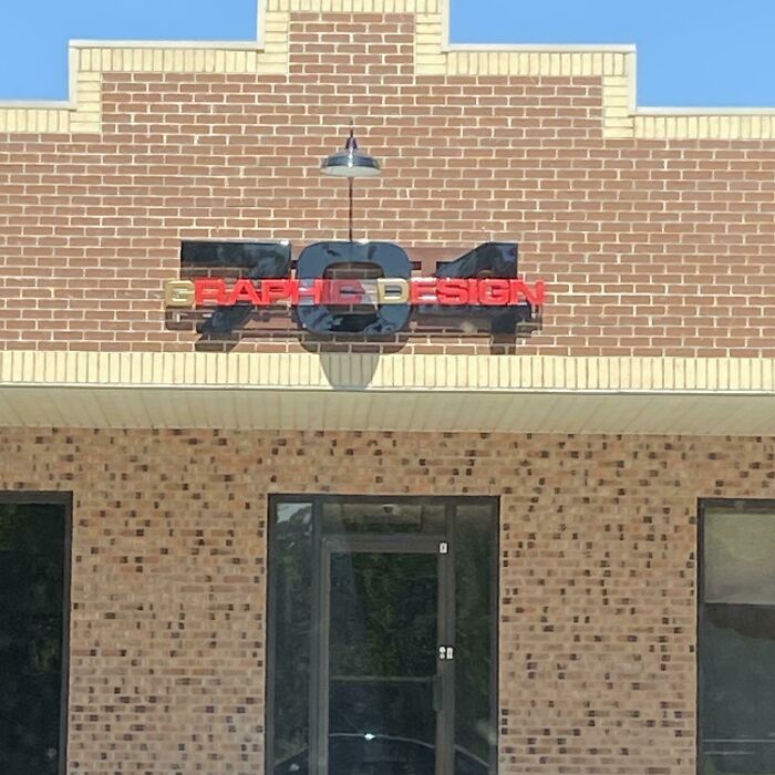
Image source: Extreme-Fee
#54 The Label For This Novelty Bottle Of Candy Has Always Bugged Me
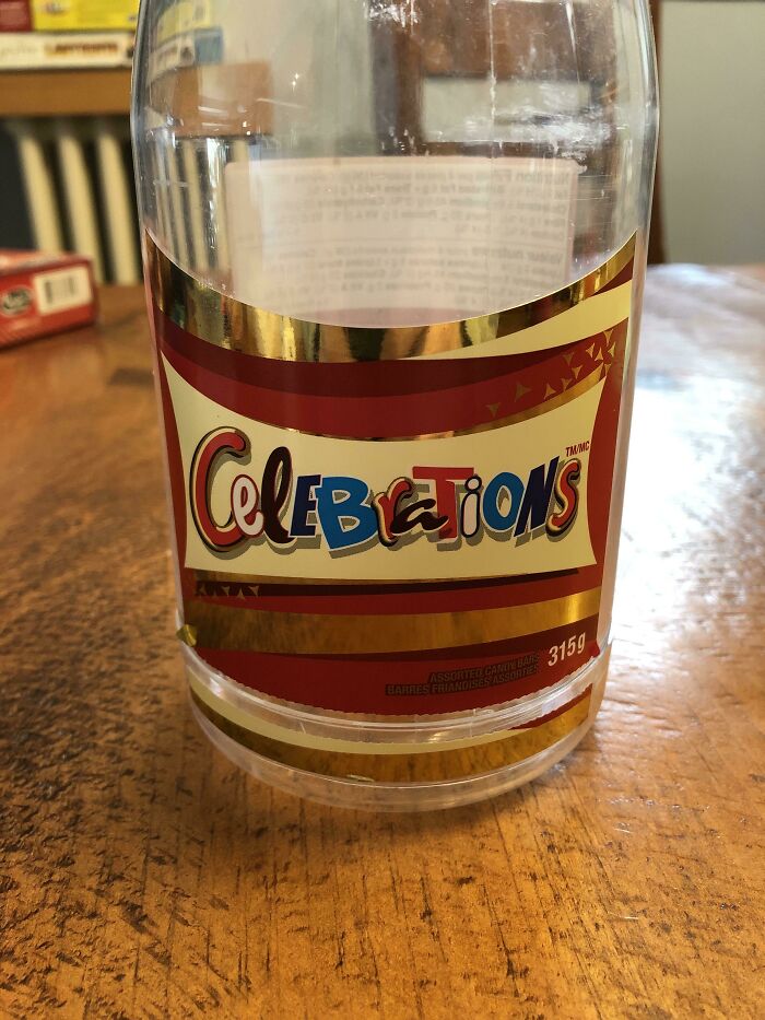
Image source: CaptWineTeeth
#55 A Designer’s Nightmare
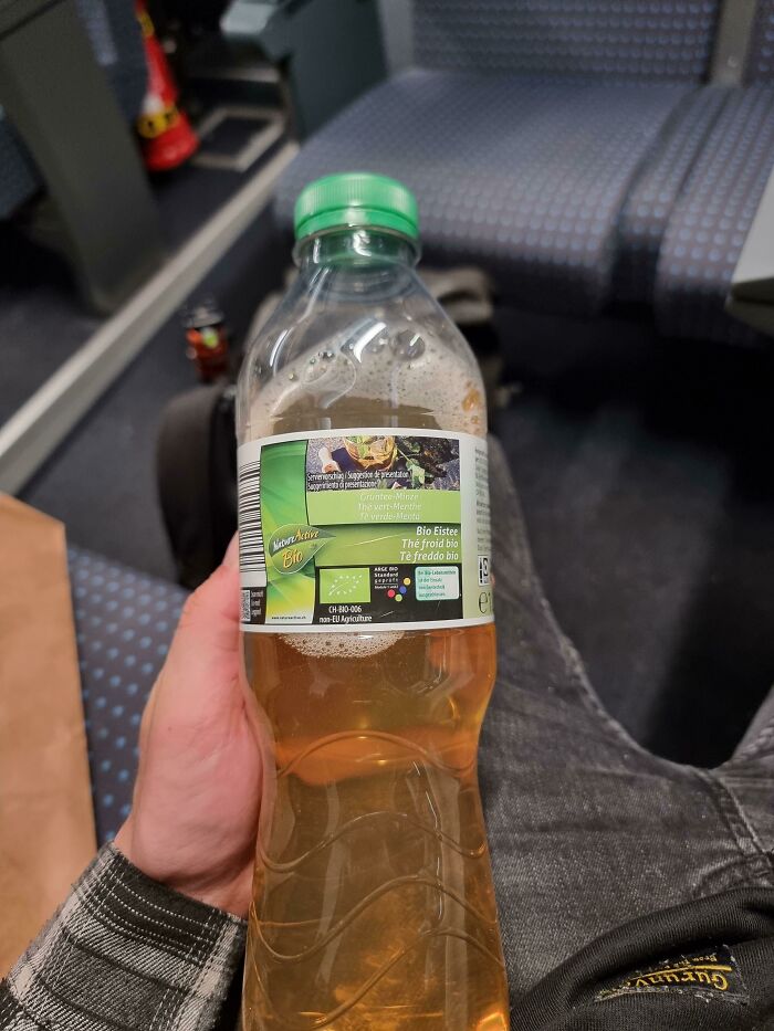
Image source: Urbex_Badger
#56 Im Going To Burger King
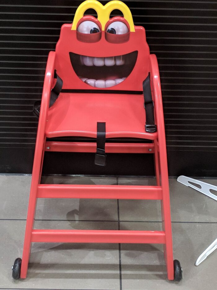
Image source: Poo-et
#57 Swap Office For For Good Food
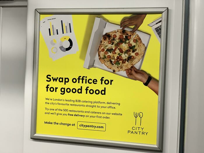
Image source: Cr0w1ey
#58 Mayo Sandwich? Look Closely Where They Are Spreading It
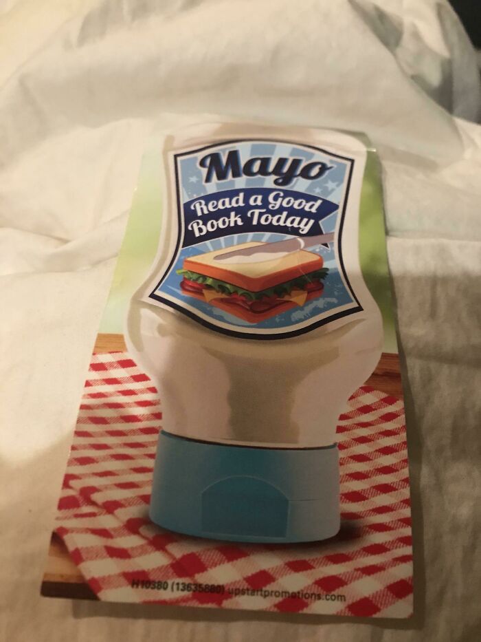
Image source: [deleted]
#59 Schreck, What Happened To You?
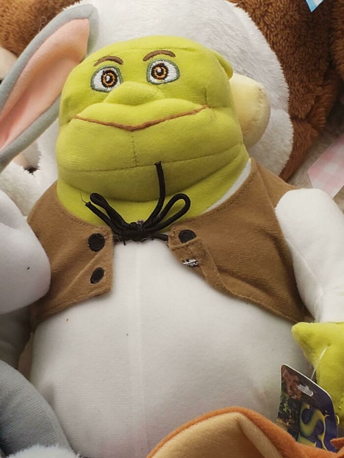
Image source: knottycrochetlady
#60 Excuse Me, “Where Can I Get “That Green Nut?”
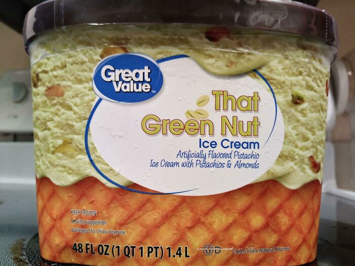
Image source: XxBananaGirlxX
#61 The Strap Goes Through His Eye
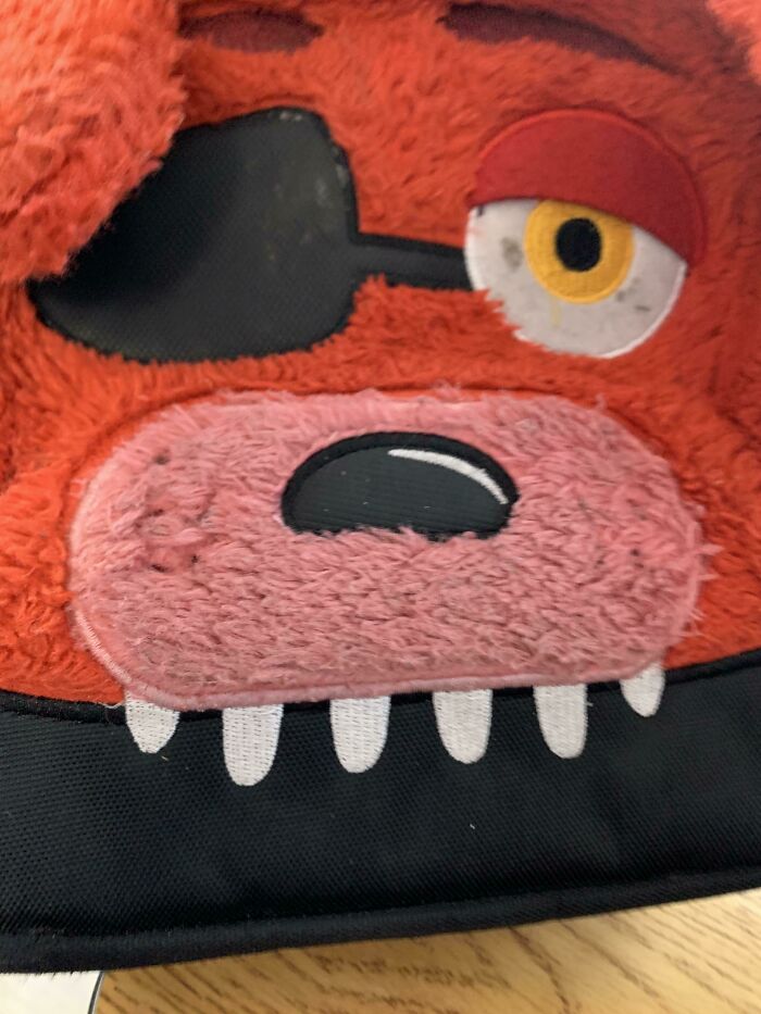
Image source: bdude1000
#62 Yeah So This Ad On Youtube Is Creeping Me Out
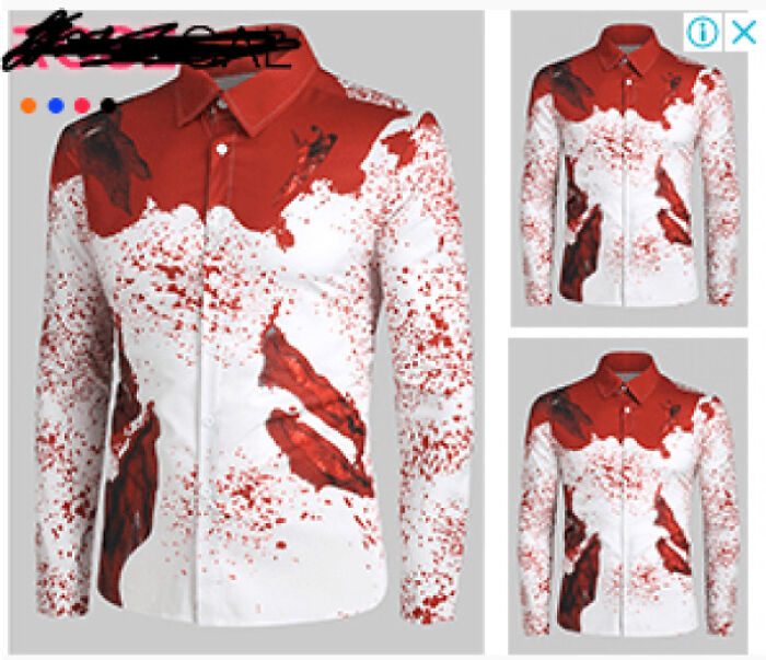
Image source: [deleted]
#63 Ah So Does That Mean Sticks Only?
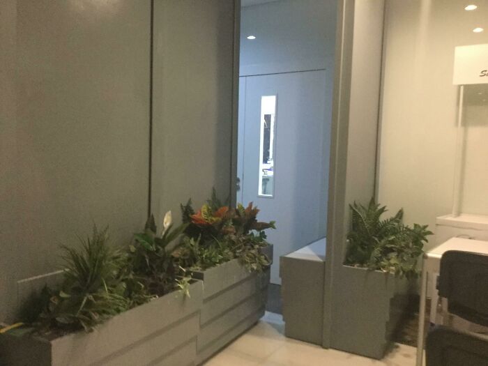
Image source: HamzaDoesStuffsYT
#64 The Middle Coffe Machine “Wake Up-Decaf”
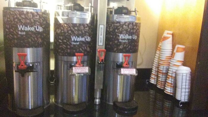
Image source: thesurvivalkidyt
#65 Official Seal Of St. Francois Count, Mo

Image source: desertSkateRatt
#66 The Company Car Of A Printing Company In The Netherlands
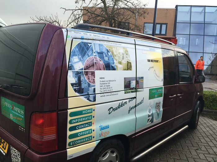
Image source: dhoomz
#67 This Pree Stained Looking “Designer” Chair
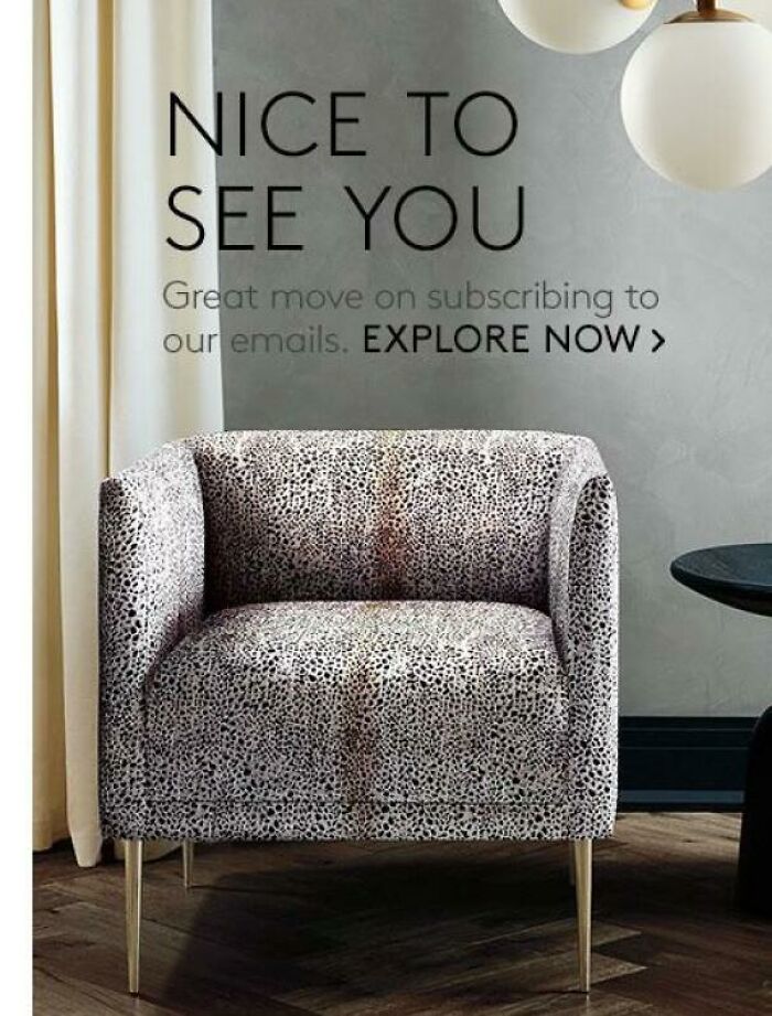
Image source: Rainbow-Death
#68 [un] See This Tab
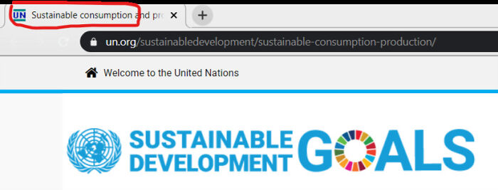
Image source: Trypoappreciation
#69 Signs Are Hard
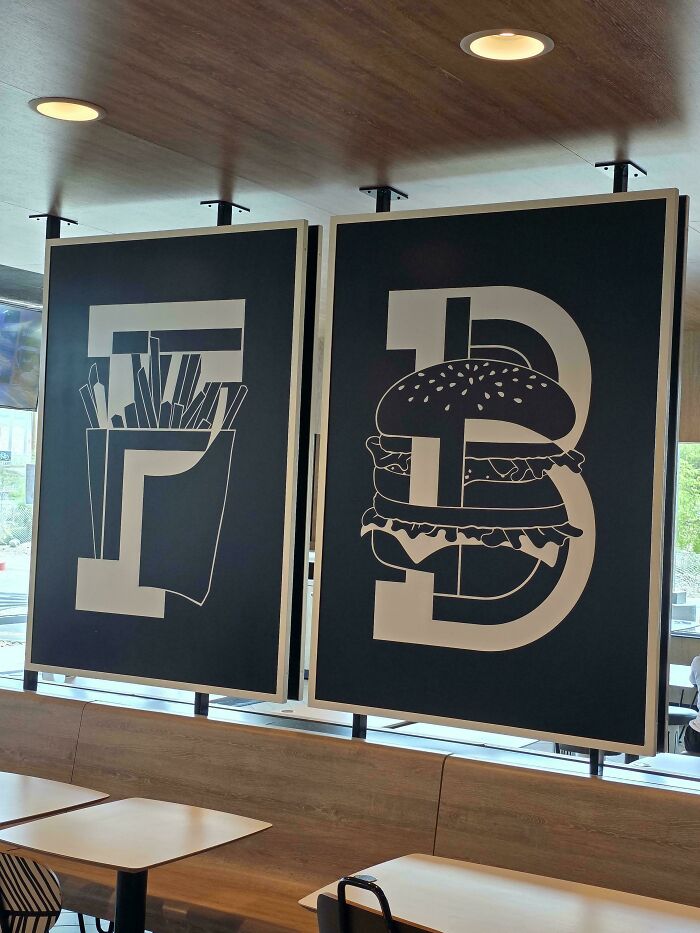
Image source: Zac9088
#70 Cleveland Cavaliers 2021 City Edition Jersey Is Straight Up Barf
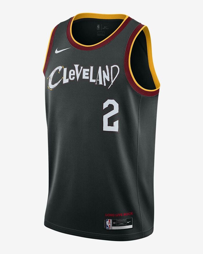
Image source: [deleted]
#71 Thank You For Comming
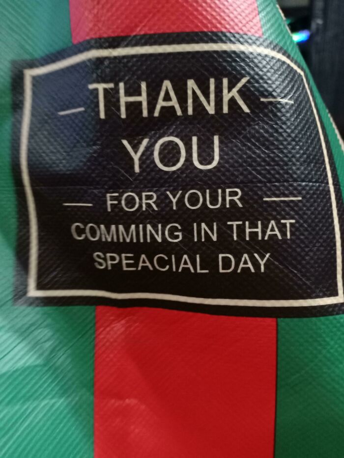
Image source: F0UL_pl4y
#72 Cinderella Got Some Issues~
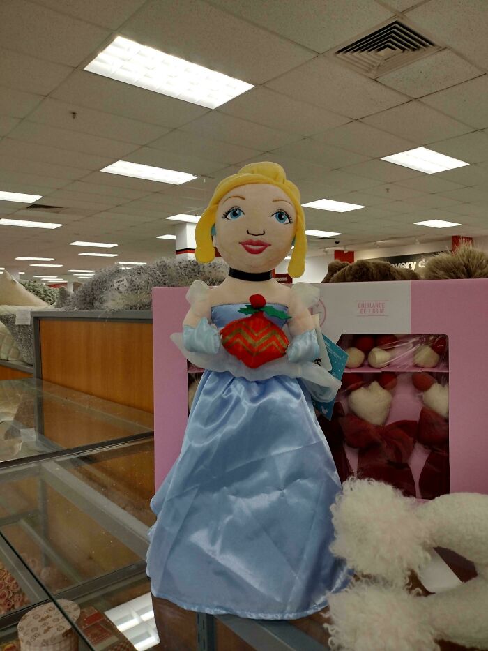
Image source: SorbetCharming9448
#73 This Duck Is Pretty Hung
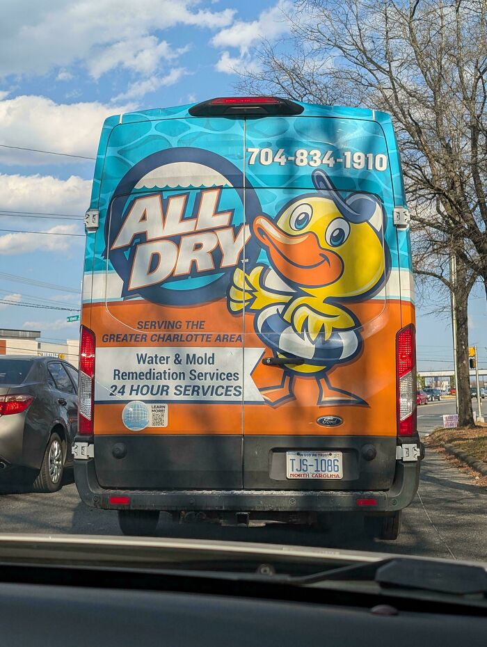
Image source: NoSatisfaction5807
 Follow Us