The Flash is the name given to a group of superheroes who appear in DC Comics. So far, four different characters have assumed the superhero powers of The Flash and this all began in 1940 when Flash Comics was first released. Between then and now, the logo for The Flash has changed many times and now in no way resembles its original format. Here is how The Flash logo has changed between 1940 and now.
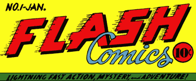
The first ever flash logo appeared on seven issues of the comic book. The word ‘FLASH’ appeared in bold red letters outlined in black, with lines coming off the left-hand side of the letters as though the word was moving at speed across the page. The word ‘Comics’ appeared just below this in pale blue with the ‘C’ overlapping the word ‘FLASH’.
Later in the same year, the logo was redesigned. Although the word ‘FLASH’ remained in the same bold, red lettering, the black marks that indicated speed was removed and replaced with white zig-zags similar to lightning behind. ‘COMICS’ was written below in white lettering. Images of Flash and Hawkman appeared on alternate issues of the comic. This logo remained on the comics until 1949.
In 1941, the ‘All-Flash Quarterly’ was released and this was a book entirely devoted to Flash. The book had a different logo than the comics as it featured the words ‘All-Flash’ in red, conjoined writing. By issue six, the lettering had been modified slightly to a bolder font.
1956 saw one of the biggest changes to the logo during what became known as the Silver Age of Flash. The words ‘THE FLASH’ appeared in angular capitals written on a diagonal and the former black lines that represented the movement at speed reappeared. Some slight tweaks were made to this design in 1959 when ‘THE’ became ‘The’ and was written in black font.
During the 1990s, there was a trend at DC Comics to constantly update their logos. That meant that The Flash logo was changed five times over 13 years. The color of the logo predominantly stayed the same, but changes were made to the style of the font and symbols used. One example is the introduction of a red lightning strike below the word ‘FLASH’.
One of the most unique logos during this time was the one that was introduced in 1999. The red background of the words was divided into segments, almost like brickwork. Some people criticized this logo for looking like flying hot dogs.
The Flash logo as it is now appeared first in 2000 but briefly disappeared. Its white lettering outlined in black and shadowed in red was much different to previous logos. This stayed until 2006 before another change was made and the lettering was colored a strange yellow-beige color. Also ‘THE FASTEST MAN ALIVE’ was added to the logo. Although this was removed after just one year.
Next came a version of the logo created by staff designer Ken Lopez that looked more like earlier versions of the logo but with a 3d effect created by the computer. Throughout the years, there have also been variations of the logo that have only been used for special editions or for the television series.
Below you’ll find a gallery of each logo in succession from the 40’s until 2010 and beyond


 Follow Us
