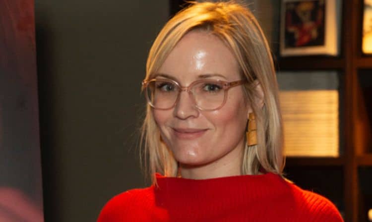
What do IFC Films’ Swallow and Lionsgate’s The Quarry have in common? Production designer Erin Magill. These are two of her most recent projects, which are now available on VOD. While these films are aesthically very different (most of Swallow takes place in Hunter’s stylized house and The Quarry is set against rustic locations in West Texas), they both fit into the same genre of being layered character dramas. This is what drew Magill to these titles and by looking at the rest of her resume, something she thrives at. Another example being Amazon Studios’ Brittany Runs a Marathon. Below we had a very insightful conversation with Magill about these projects and much, much more. Read the exclusive interview here.
How did you get in to production design?
Growing up I had always been very artistic and loved film and tv, but I wasn’t exactly sure how I could use those skills and interests to find a job. Then during my undergrad, where I majored in design and minored in film theory, I took a theater design course. While the theater wasn’t as enticing to me, our teacher, John Iocovelli, also designed films and showed us his behind the scenes photos while designing Honey I Shrunk the Kids. That was a definite “Aha” moment for me in terms of “that’s a job?! How do I get that job?” At the time I was living in northern California and started my career in the art department at Pixar, eventually heading to LA for grad school at AFI when I knew I wanted to transition in live action film design.
-How did you get involved with The Quarry?
I was introduced to the producers and the director through a line producer I have worked with previously. They had been scouting to shoot in Oklahoma and then last minute decided on Louisiana so it all happened very quickly, but Scott and I had a great phone call and seemed to be on the same page aesthetically.
–The Quarry is directed by Scott Teems. What were some of the most important things he wanted to convey in the film through the production design?
While the script was specific, I think Scott was most interested in the story as an allegory for good, evil, the purpose of god and religion. Throughout our discussions of these ideas, who the characters were and could be representing, it became apparent to me he really wanted a timeless feel to the world; the idea that this small town wrestling with economic hardship and immigration issues could be found anywhere in America and any time in the past thirty years. This idea was the foundational basis for all of my design choices.
-Look wise, The Quarry is the exact opposite of your last film Swallow. What are some of the benefits of doing very different films like this close together?
We prepped and shot Swallow in the Spring of 2018 in upstate New York. Quarry was actually shot around the same time one year later in 2019 in and around New Orleans. So there was actually a fair amount of time between the projects, but both, while quite different in the geographical location and socio-economic setting of the story, were the layered character drama type of films I was looking to design.
-Is there a scene in The Quarry that you would like audiences to pay special attention to, production design wise?
We had a very limited prep time due to a strict shooting schedule based on Michael Shannon’s availability and we were unable to find any existing jail cells or standing sets in and around New Orleans that worked for us. We ended up shooting the exterior of our police station on location in Garyville, LA, where we staged all the exteriors of our fictional town, Bevel. But the inside of the station was constructed in an abandoned Wynn Dixie corporate headquarters outside of New Orleans. Using one existing concrete wall that had a great age to it, we built out the rest of the jail cell space and storage area to match, along with the chief’s office and entry area. It was a lot of construction, scenic work and all the set dressing was brought in. Fortunately, I had an incredible local crew of artisans from New Orleans who were all passionate about the project.
-How do you decide with projects when less is actually more?
I’m drawn to stories we haven’t seen or heard before on screen that often contain layered and flawed characters who speak honestly to the human experience. As a designer, of course, world building is enticing, but creating an authentic world true to the story/script is what drives me and is the basis for all of my choices. Sometimes that involves the design being bold, layered, front and center, but if I’ve done my job right, the viewer isn’t noticing whether the set is subtle or not, they are hopefully believing the world I have created for that moment in the story.
–The Quarry takes place in West Texas. How familiar were you with the style found in a small rustic town like this?
My first concern when coming onboard was Quarry being scripted for West Texas, and knowing we were going to be shooting in and around New Orleans. Part of my job is to have the knowledge of what is notably West Texas vs. New Orleans so that I can offer opinions on locations to avoid or what can be amended because of their distinct architectural features or plant life that will not read believably as Texas. Besides research along these lines, I used a lot of the photography of William Eggleston, Wim Wenders and Alec Soth as inspirations for life in a small rustic town.
-Were there any specific challenges you had to overcome with The Quarry?
Quarry is a near period drama set in the late 1980s. Because of a variety of production needs, I was faced with multiple sets having one location as their exterior and another as the interior. The marrying of the two involved a fair amount of construction and scenic work that the film had originally not budgeted for. Thankfully because of some amazing and talented craftswomen in the New Orleans film community, I was able to pull this off.
-The church has a very unique look in The Quarry. From the orange curtains behind the pulpit to the blue stained glass. Was most of this already in the location when you arrived? How much did you have to transform for this scene?
As I mentioned with the police station, similarly the exterior of the church was shot at one location, but the interior, in order to get the shots and lighting the director and DP had hoped for would need to be shot elsewhere. Therefore, the interior church set was built within our ext cafe set which normally served as a bar for the town of Garyville. So not only did we build one entry window plug wall mimicking our exterior location, but we also needed to transform the bar space into a church, which meant another plug wall covering existing piping and a platform and railing for our pulpit. The chartreuse curtains were a cost-effective way for us to mask the ends of the plug walls, while also still allowing access for the camera and lighting crews. The bar location had a few existing colored stained-glass windows, so using this as inspiration and as another way to integrate the two locations as our one church – I carried the colored glass idea into the entry windows we were constructing at both locations. While all of these choices were rooted in solving production logistical issues, all were made in line with prioritizing the concept of a small town non-denominational church, that had likely been set up decades ago in a structure that wasn’t originally built to be a church.
-What would you say is the most important part of your job?
Taking into account the script, the director’s wishes and production restraints, the designer formulates an overall vision and plan to evoke the emotions, themes and actions within a script. This includes every location or built set, from floor to ceiling, wall to a wall, interior and exterior, and therefore a production designer must wear many hats: historian, sociologist, anthropologist, color theorist, architect, artist, interior designer and engineer. But I believe the ability to empathize while wearing any of those hats is the most important skill of a designer or any storyteller.
-You worked on Amy Poehler’s upcoming film, Moxie, for Netflix. Can you talk a little bit about this and working with Amy?
Moxie, is a coming of age dramedy based on the bestselling YA book of the same name. In the film, a teenage girl inspired by her mother’s involvement in the Riot Grrrl movement, starts a feminist revolution at her high school. The book was actually set in a fictional small Texas town, but Amy and the writers reset the film for a fictional small town in Oregon, which I thought was the right move in line with the history of the Riot Grrrl movement’s importance in the Pacific northwest. Amy plays the lead’s mother, a working single mom, and she was very concerned with authentically representing the socio-economic status of not only her character’s world, but of this middle/working class small town. As a designer who strives to be as respectful to the story and characters as possible, I really appreciated Amy’s passion and thoughtfulness around these issues.
 Follow Us


