Maps do not have to stop at showing where one country ends and another begins. Put the right information on one, and suddenly you can spot curious connections or learn something about the world you had never even considered before.
We gathered a bunch of fascinating maps from two online communities that cannot seem to get enough of them. Scroll down to check them out and see what you discover.
#1 Think You’re Safe In Australia? The Kangaroos Actually Run The Place!
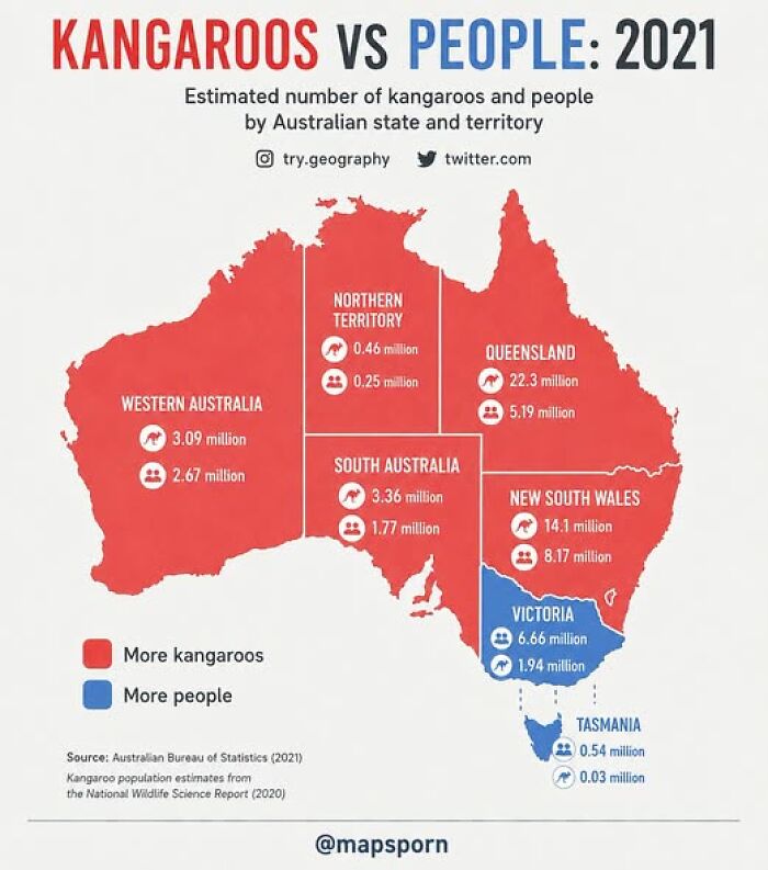
Image source: Pary Hour

#2 How Far Are You From A Beach Day Right Now?
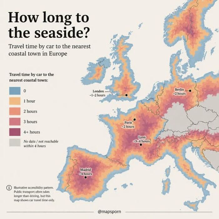
Image source: Pary Hour
#3 History Of Literacy In Greece And Turkey
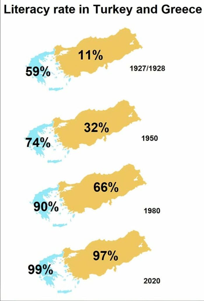
Image source: Pary Hour
These days, maps are part of everyday life in a way we barely even think about. We open them to check where the bus is, find a nearby café, or figure out the quickest way home.
Even after living in the same city for years, plenty of us still reach for our phones the second we need to go somewhere unfamiliar. More than 2 billion people use Google Maps each month, which gives you an idea of just how common that habit has become.
#4 Think Most Of The World’s Muslim Population Lives In The Middle East? Think Again!
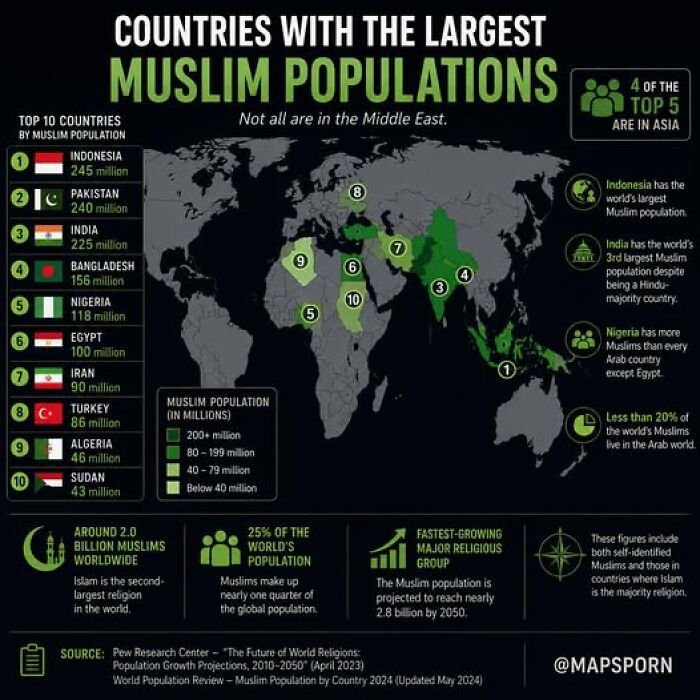
Image source: Pary Hour
#5 The Percentage Of Women Among Judges In Europe
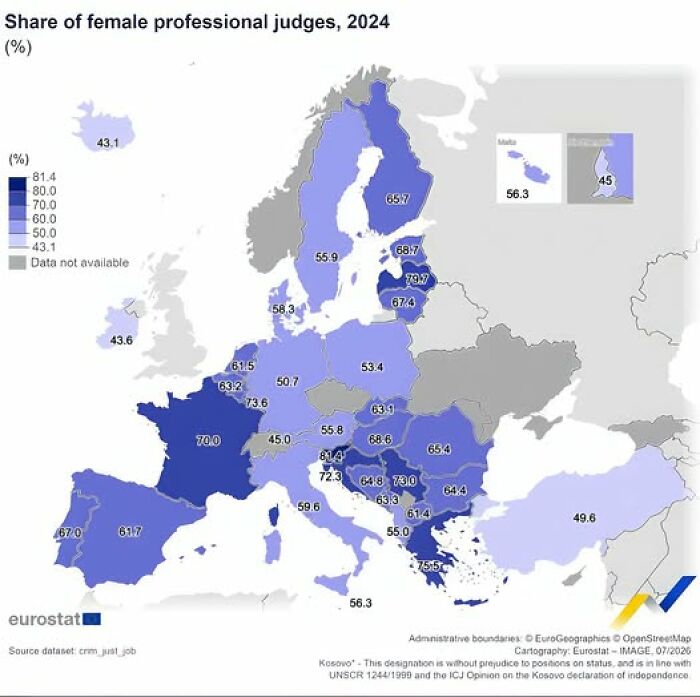
Image source: Pary Hour
#6 Did You Know That Only A Handful Of European Countries Still Have An Official State Religion?
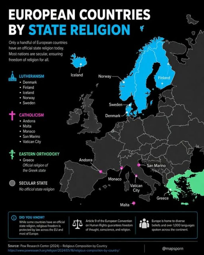
Image source: Pary Hour
In fact, some of us may have become a little too comfortable with having directions available at all times. A 2019 survey found that 53% of millennials said they would struggle to find their way somewhere without their phone.
Another 15% said they had never even read a traditional paper map. Take away the blue dot telling us exactly where we are, and apparently quite a few of us would be in trouble.
#7 Did You Know Some Countries Exist In Two Places At Once?
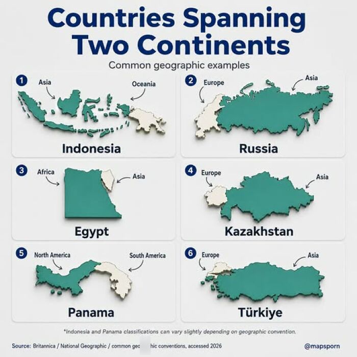
Image source: Pary Hour
#8 The Shortest Driving Route Through All 48 Contiguous Us States
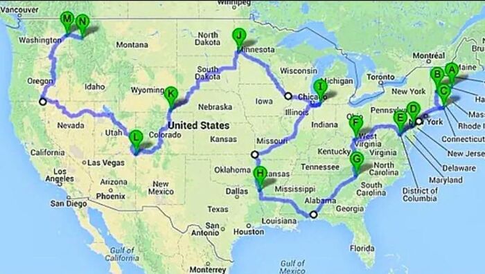
Image source: Pary Hour
#9 Every Catholic Church In The Baltic States — All 1,069 Of Them
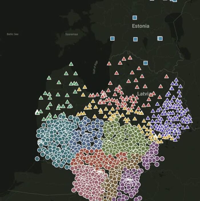
Image source: Pary Hour
What we have now is quite a luxury when you consider how long people have been trying to make sense of the places around them. According to Smithsonian Magazine, one of the oldest surviving maps is the Babylonian Map of the World, created sometime between 700 and 500 B.C.
It was drawn on a small clay tablet and showed Babylon at the center. It was not especially detailed or useful for getting from one place to another. Instead, historian Jerry Brotton told the magazine there was something almost “talismanic” about being able to hold a picture of the world in your hands.
#10 The Great North American Soda Divide!
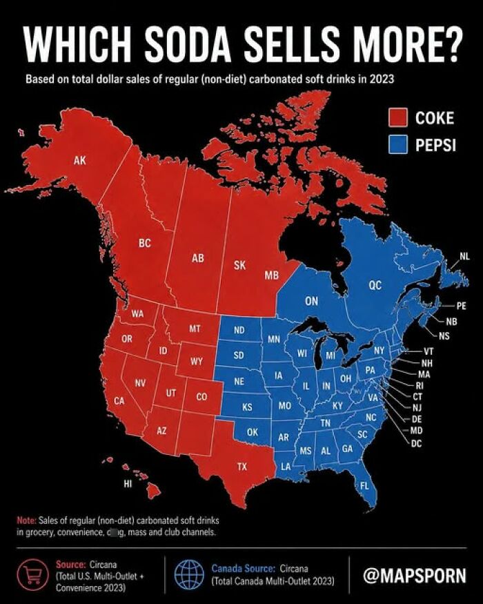
Image source: Pary Hour
#11 Europe’s Foreign Language Gap
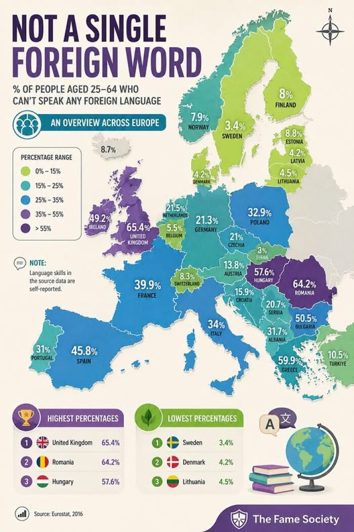
Image source: Pary Hour
#12 Feeling The ‘Whey’ After Dairy? 🧀 Don’t Have A Melt-Down! You’re Likely Not Alone, Especially Depending On Where Your Family Is From
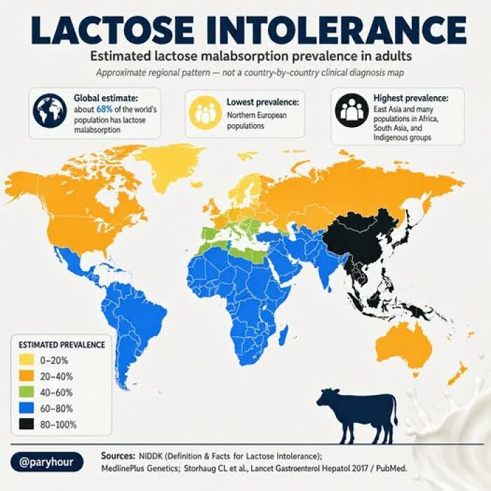
Image source: Pary Hour
Maps slowly became more precise, although getting there took centuries. One major step came in the second century A.D., when Claudius Ptolemy created a system using latitude and longitude and plotted thousands of locations.
Interestingly, Smithsonian notes that his interest in accurate geography was partly connected to astrology. Ptolemy wanted to know exactly where someone had been born so he could create more accurate horoscopes.
His work eventually became hugely important for mapmaking, even though it disappeared from much of Western Europe for around a thousand years.
#13 Is Strapped-In Safety A Global Rule, Or A Local Choice?
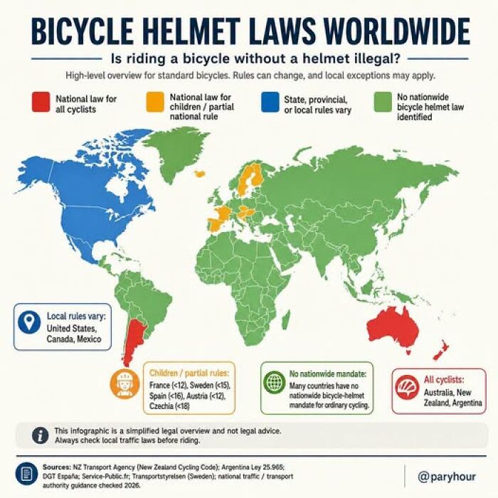
Image source: Pary Hour
#14 North America If The Sea Level Rises Another 2 Inches From Climate Change
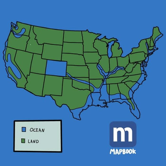
Image source: Pary Hour
#15 Most Common Type Of Livestock In Europe
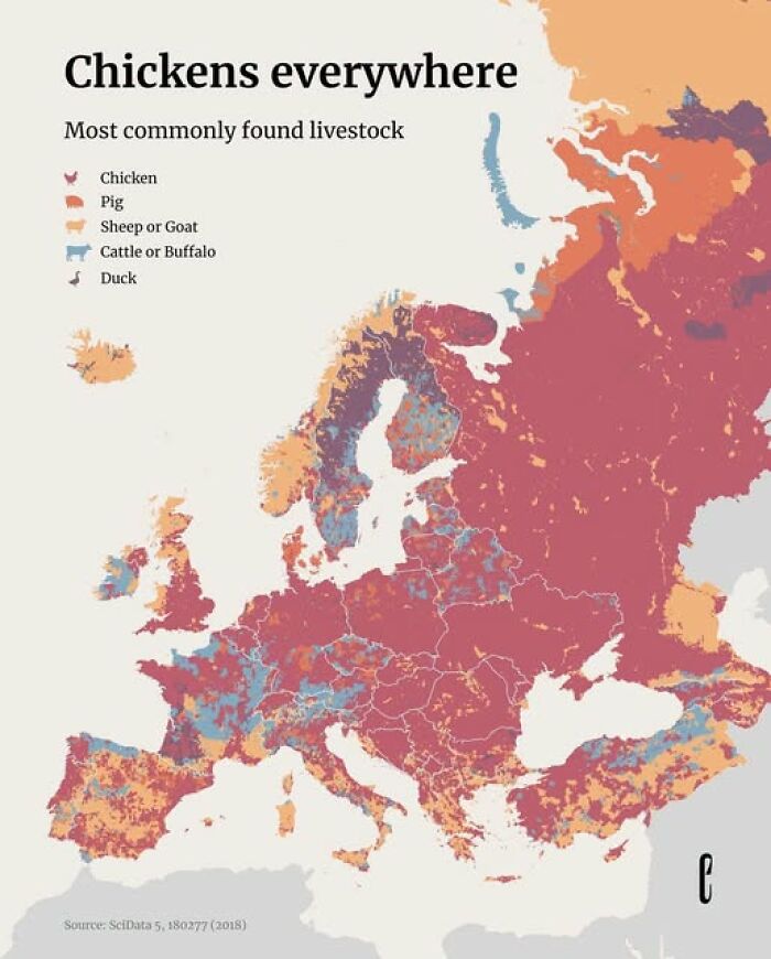
Image source: Pary Hour
By the Renaissance, accurate maps were becoming much more important. Ships were travelling farther, while rulers wanted clearer pictures of the lands they controlled. Better compasses helped sailors find their way, and old ideas from Ptolemy were rediscovered.
Then, in 1569, Gerardus Mercator introduced the projection that still influences many maps we see today. It made navigation easier because sailors could plot straight courses across the map.
#16 Which Country Do You Think Has The Best Mediterranean Coast
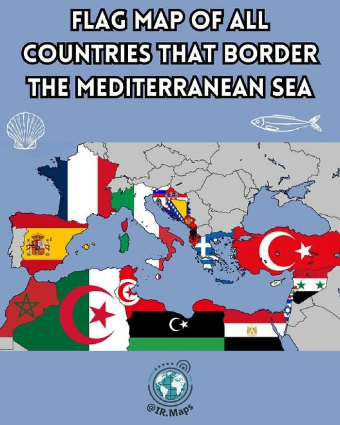
Image source: Pary Hour
#17 Map Of The Mississippi River And Its Tributaries
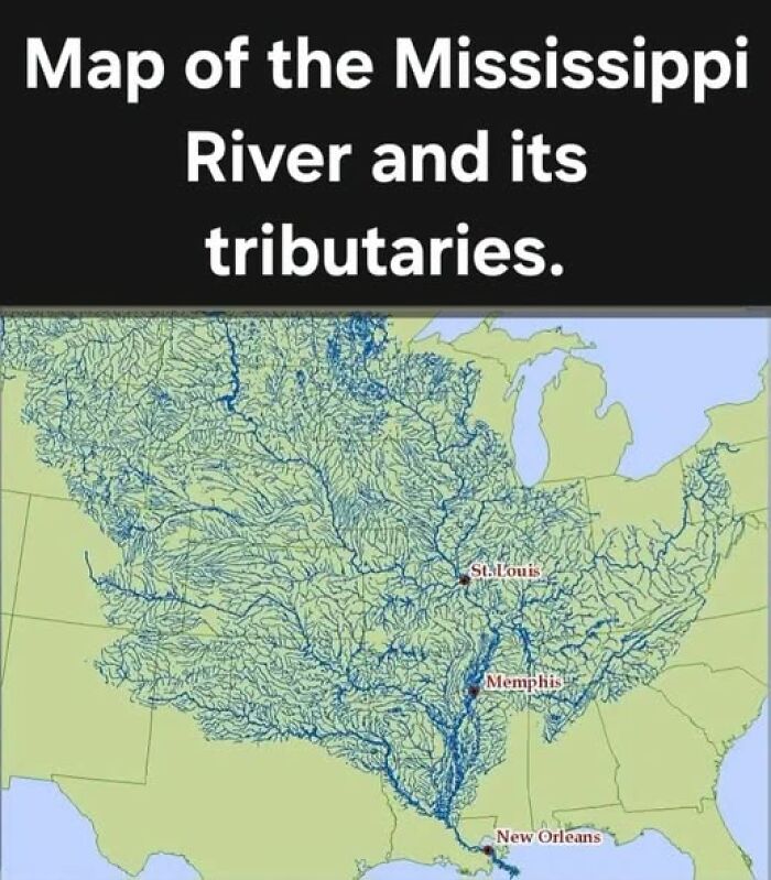
Image source: Pary Hour
#18 Who Keeps Europe Running?
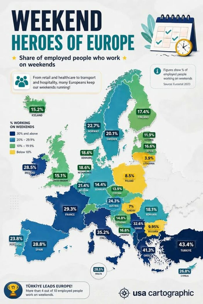
Image source: Pary Hour
There was one major catch. Flattening a round planet onto a flat surface always involves some distortion, and the Mercator projection makes places closer to the poles look much bigger than they really are.
That means countries in northern parts of the globe can appear enormous, while Africa looks much smaller in comparison. Once you see countries shown at their real relative sizes, it can be pretty mind-blowing.
#19 How Diverse Is Europe’s Younger Generation?
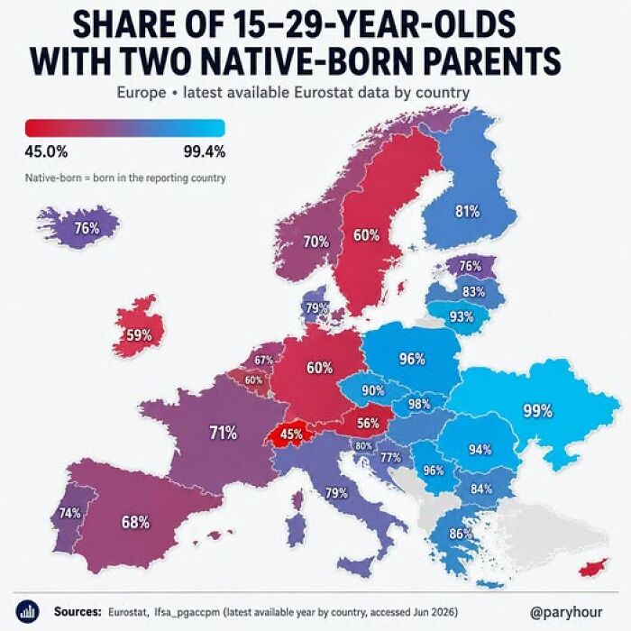
Image source: Pary Hour
#20 Daylight Saving Time
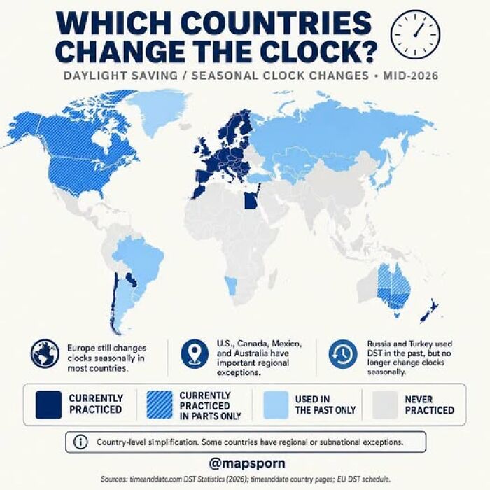
Image source: Pary Hour
#21 2026 June Heatwave: Effects On Natural Landscape In Western France
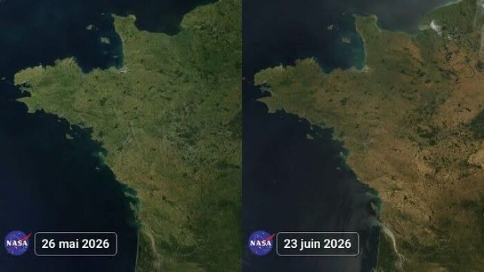
Image source: Pary Hour
As mapmaking became more detailed, people also started using maps to show much more than physical geography. By the late 19th century, some maps could show individual buildings with remarkable detail.
Businesses quickly realized that being included could be valuable, too. According to Smithsonian, some American mapmakers even charged merchants to have their buildings featured more prominently.
#22 How European Countries’ Names Are Pronounced By Japanese
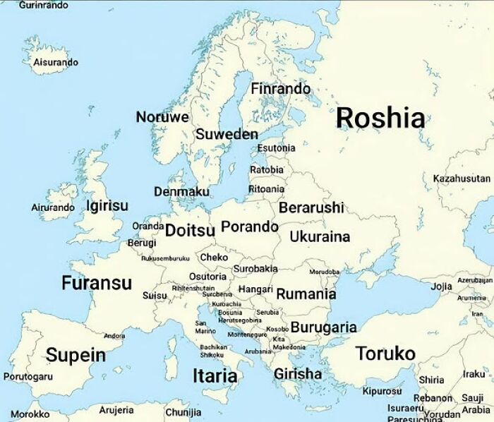
Image source: Pary Hour
#23 Mapping U.S. Rivers In Proportion To Their Flow Rate
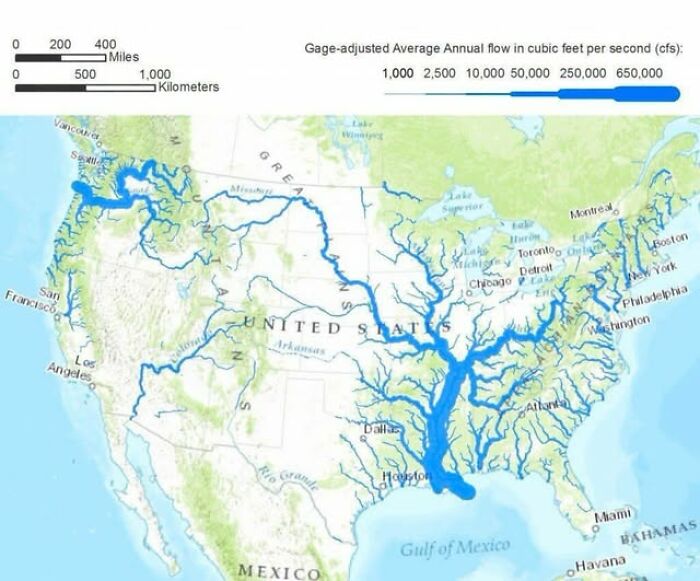
Image source: Pary Hour
#24 Ever Wonder How A “Straight-A” Student In One Country Would Fair In Another?
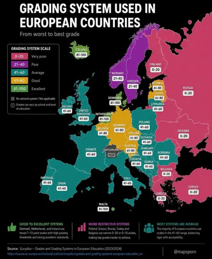
Image source: Pary Hour
Maps could carry much more serious messages as well. In the 1880s, social reformer Charles Booth created a map of London that color-coded areas according to income and supposed criminal behavior.
His goal was partly to draw attention to poverty, yet dividing neighborhoods in this way could also reinforce harmful ideas about the people living there. Similar thinking later appeared in American redlining, when banks refused loans to people based on where they lived.
#25 Why Is There Such A Massive Time Zone Misalignment In Western North America?
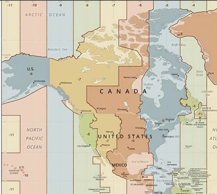
Image source: Pary Hour
#26 Europe’s Religiously Unaffiliated Population By Country
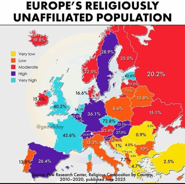
Image source: Pary Hour
#27 Approval Rating Of World Leaders (Jun 2026)
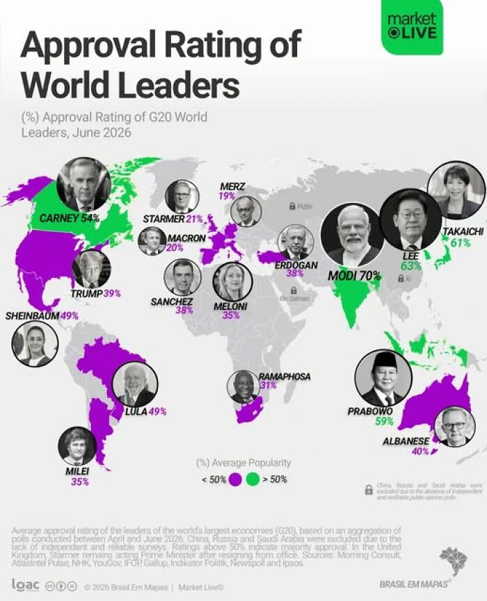
Image source: Pary Hour
So, as fascinating as maps can be, it is still worth looking at them with a critical eye. Depending on who created a map and what information they chose to include, it can influence how we understand the world and even how we see certain countries or local communities.
In the wrong hands, that kind of influence can become surprisingly powerful. It is something worth keeping in mind the next time a map catches your attention.
#28 What North America Looked Like 92 Million Years Ago
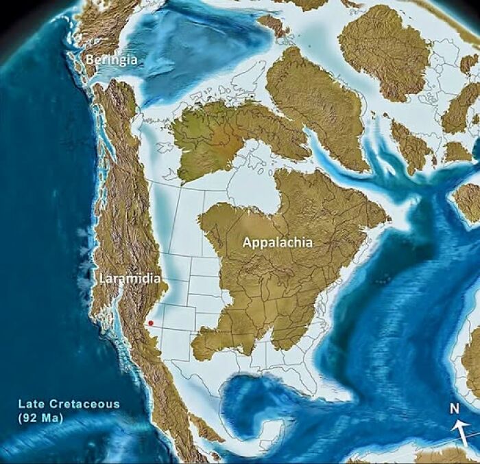
Image source: Pary Hour
#29 What Explains The Western Part Of Indonesia Being Of An Islamic Majority While The Eastern Side Is Being Of A Christian Majority, With The Island Of Bali Being Hindu Majority?
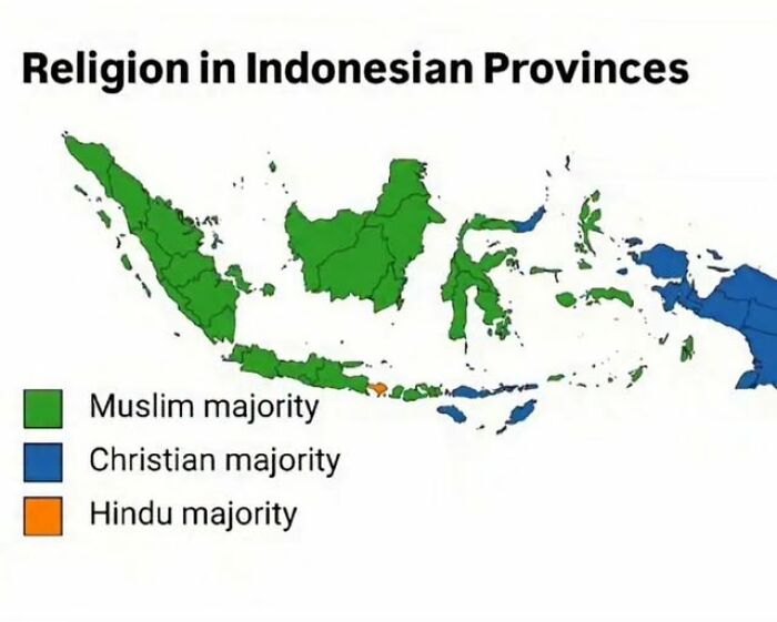
Image source: Pary Hour
#30 Where German Is An Official Language
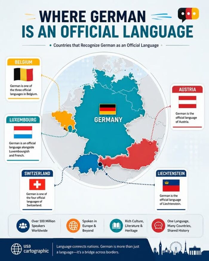
Image source: Pary Hour
#31 Celtic Nations
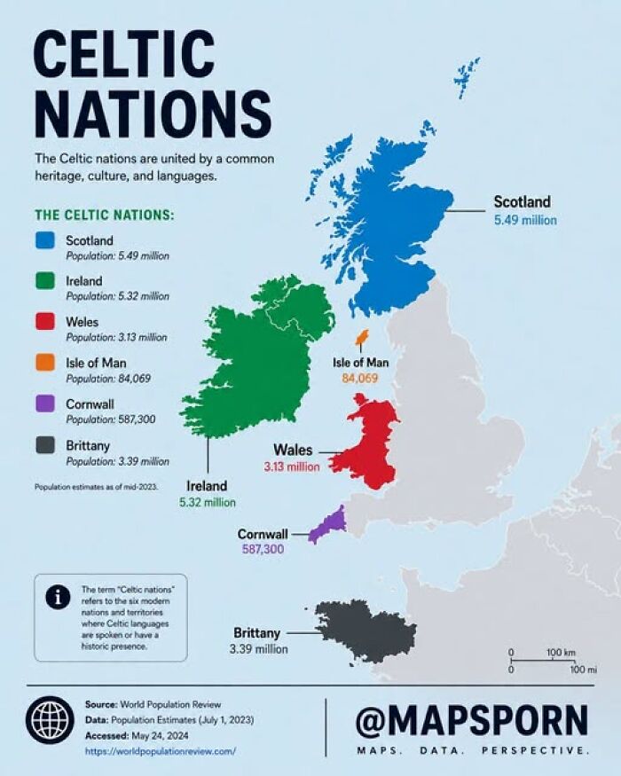
Image source: Pary Hour
#32 Would You Feel Safe Walking Alone At Night In These Countries?
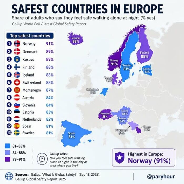
Image source: Pary Hour
#33 A Massive Country, But Look Where Everyone Is Actually Moving!
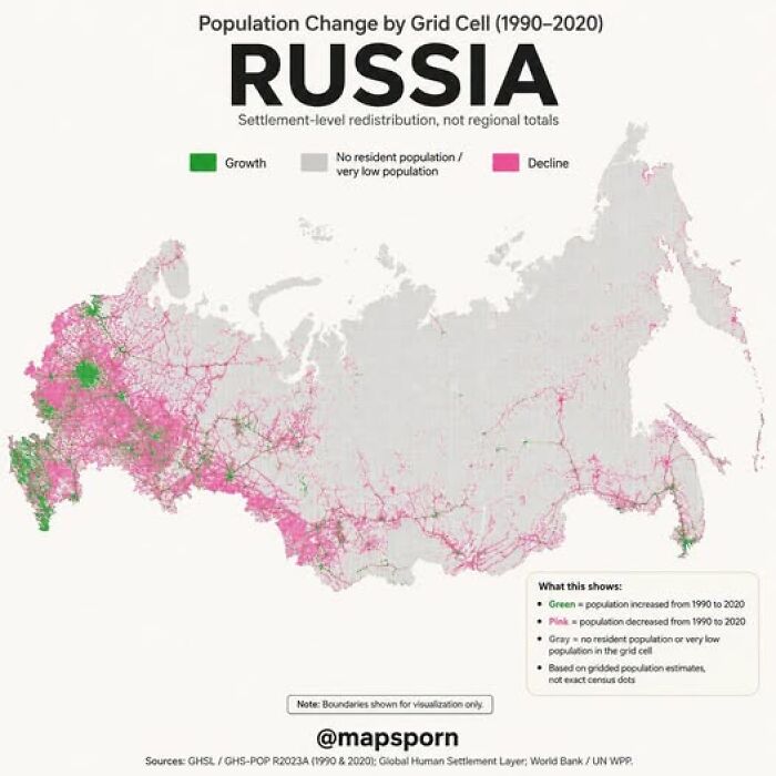
Image source: Pary Hour
#34 A Comparison Of Climatic Analogues Across The Northern Hemisphere
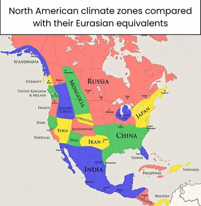
Image source: Pary Hour
#35 The Longest Possible Straight-Line Journey By Sea Is From Russia To Pakistan, Covering Over 20,000 Miles
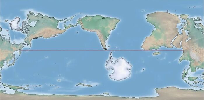
Image source: Pary Hour
#36 European Countries Where More People Passed Away Than Were Born In 2024
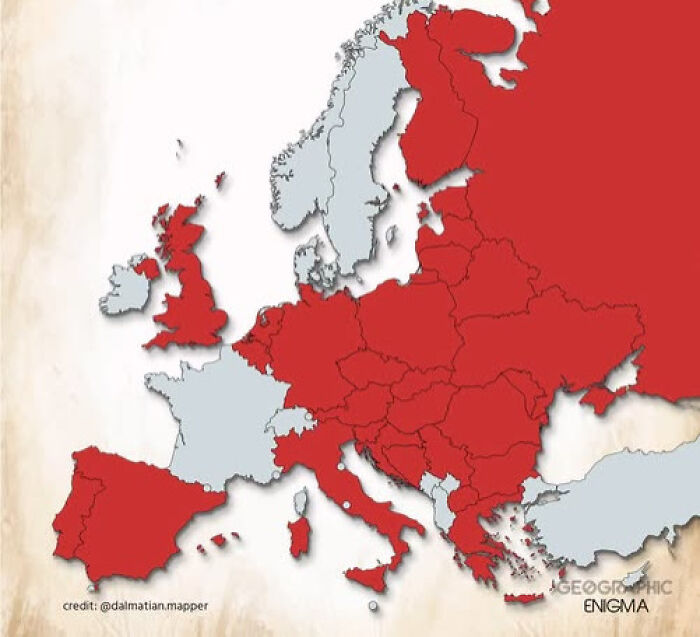
Image source: Pary Hour
#37 The True Size Of Kosovo Compared To Serbia
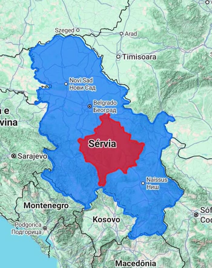
Image source: Pary Hour
#38 The Most Common Term For Someone Who Has No Money
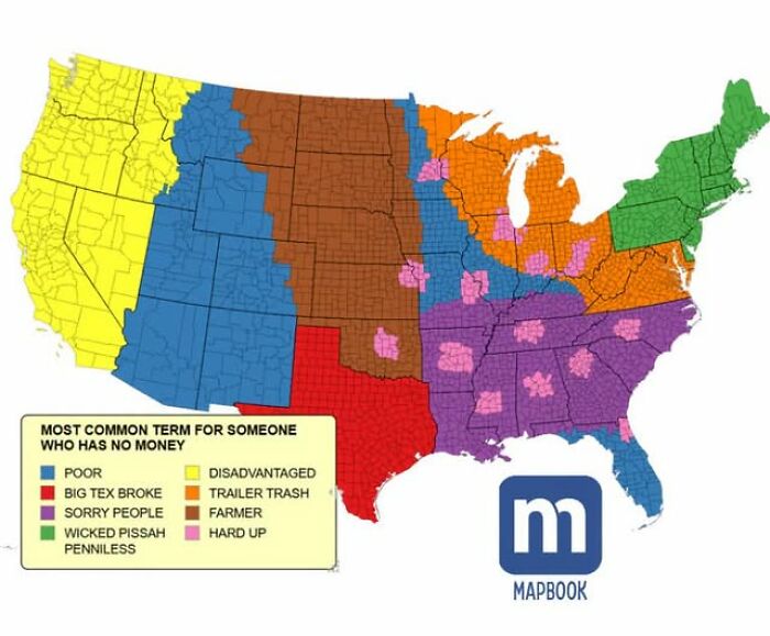
Image source: Pary Hour
#39 Cuban 🇨🇺 And Canadian 🇨🇦 Immigrants In Louisville Kentucky
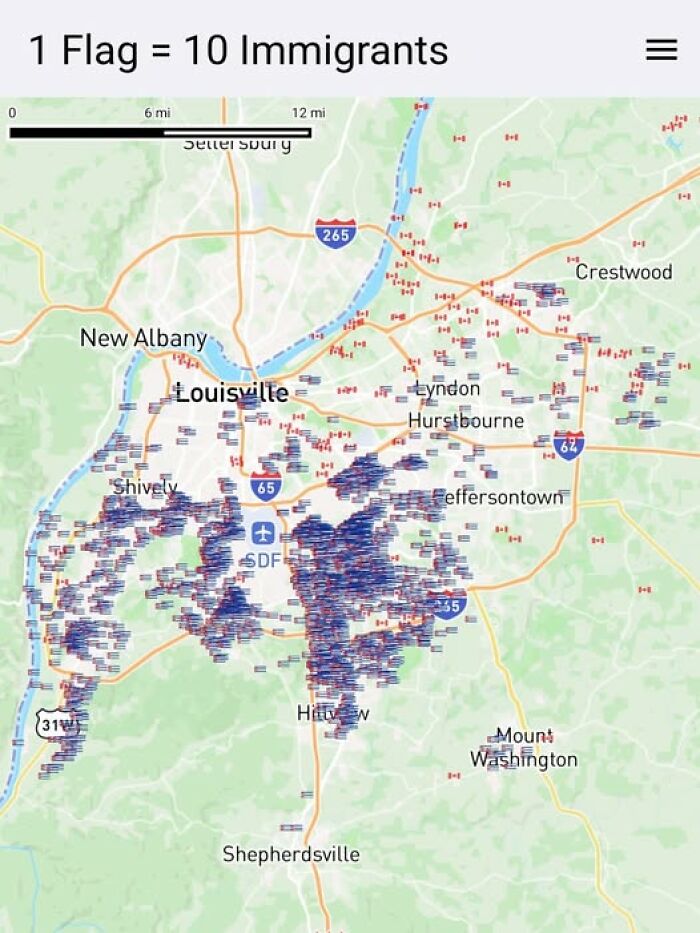
Image source: Pary Hour
 Follow Us