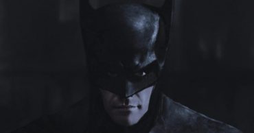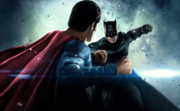
We’ve all seen the visuals for the DC movies that have come out and are still yet to come out yeah? They’re amazing to put it lightly, especially the action scenes that show the heroes about to get busy. But Justin Bellman, a noted and talented artist, is able to take the live action pictures and render them in the same animated style we’ve seen in the cartoon versions of DC movies. The effect is pretty cool really and brings back an old-school feel of nostalgia that is comforting for many fans. The new cinematic posters are pretty awesome and are even more appreciated considering that the live-action version of the Justice League is bound to be amazing, but with Bellman’s renderings the feeling is that he’s given the fans what they want to see.
Plus, it’s just a cool effect.
Maybe someone should have fed Jason Momoa before the shoot? Gal Gadot has that patient “take the picture” look while Ben and Ezra look pretty cozy. Do you get the sense that Gal is fully aware that she’s the only girl in a boys club and is quietly but patiently enduring it all?
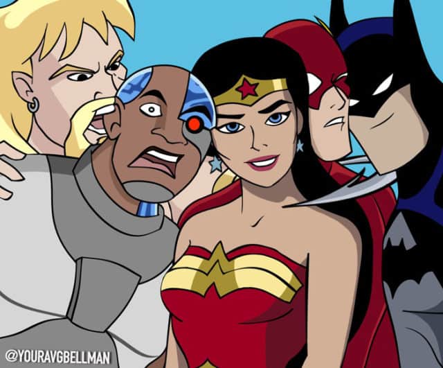
That look of patience doesn’t seem to go away with this drawing as Wonder Woman is no doubt thinking something along the lines of “Why me?” as the guys have their fun. This time though Aquaman seems to be genuinely hungry as he’s focused entirely on Cyborg’s remaining ear, and Flash and Batman best not move too quickly lest there be a mishap of some sort.
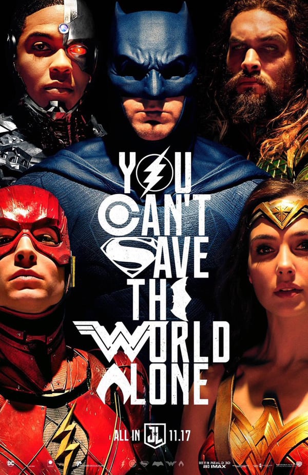
It’s an impressive poster really, but where are Batman’s eyes? For such a great poster the use of shadows is a little overplayed, especially since these are the good guys. Every one of them look a little foreboding, even Wonder Woman, who’s been hyped thus far as a paragon of virtue since her emergence onto the big screen. Great poster, but the shadows are a little too much.
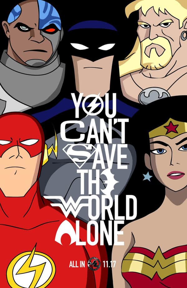
From shadows to a spotlight, the contrast button seems to be off a bit when it comes to this picture. Perhaps one of the biggest differences though is the face shape of Batman, Aquaman, and the Flash. In the cartoon form they’ve always seemed to be unnaturally long. It’s been the norm for a while, but when put against the live action version it’s definitely noticeable. Poor Cyborg though, the shape of his head is more like a cueball with eyes.
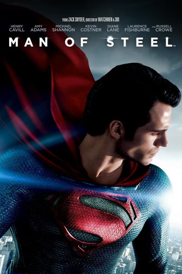
This picture is supposed to be iconic and impressive but the new look of the suit makes it a little dizzying to be honest.
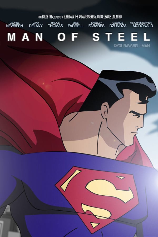
It would almost be better if Superman wore armor just so the suit didn’t mold to him in such a way. But then again, a man that can deflect bullets with his bare skin obviously doesn’t need armor.

For what was supposed to be lauded as one of the best films in a long, long time, Batman vs. Superman was kind of a dud in a lot of respects. The visuals should look impressive but really they give birth to the thoughts that such a fight would be kind of ludicrous.
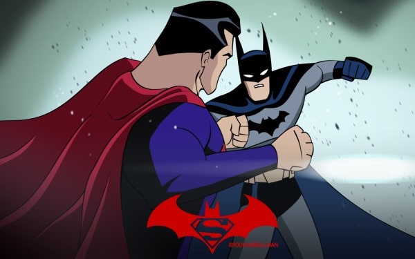
It’s not just because of the size difference brought on by the perspective of the shot, but it’s also confusing to know what Batman is looking at. In the live action picture you can at least see which direction his eyes are going.
So yes, Bellman does a great job of rendering these pictures into cartoons, but quite honestly the live action is a little more impressive at this point. No offense Bellman, you do great work.
 Follow Us
