Creating a company logo is a fine art in and of itself. Just imagine: trying to generate something that should represent a company’s entire history and personality—which would translate into thousands of pages in length—but it should also be able to fit on a single business card. It’s like shoving 9 gigabytes worth of memes onto a single 3.5 inch floppy disk. It’s ridiculously hard, so getting creative is key.
Well, designer and TikToker Emily Zugay has been getting super creative in redesigning famous logos… with a twist… that twist being “improving” upon said logos in ways that make them… well… definitely something, all right!
Emily’s redesigns have been going quite viral lately, so we’ve compiled a list of her redesigned logos below. And while you’re down there, why not vote and comment on the ones you liked the most!
#1
“Next I did Detroit’s football team the Lines and I don’t really understand your logo. It needed to be simplified quite a bit, sorry, just clean it up. And this will look a lot nicer on jerseys, helmets merchandise.”

Image source: Emily Zugay
#2
“Next, we have Tampax. An awful logo, but we really need a stronger one, especially for competing with Trojan and Magnum. With that being said, I chose a stronger, more masculine font to fit my vision. And I also added a line underneath it.”

Image source: Emily Zugay
#3
“The next victim is Tinder as a dating brand. I don’t know how I’m supposed to trust you because your whole logo is lowercase. And that doesn’t sound very confident to me. I capitalized the logo and then I included a tagline just so people understand how the app works. Swipe right.”

Image source: Emily Zugay
#4
“The first logo I chose to work on was Starbucks. I don’t like anything about it. I hate this green color. I don’t like this figure. I don’t even know who that is. Maybe the president or something. The font is also just tacky and outdated. So I redesigned it with more of a happier feel. I wanted to maintain the integrity of the stars and the original logo because I truly think that’s the only good thing about it. And then I chose this nice contemporary font that pulls it all together.”

Image source: Emily Zugay
#5
“The second contestant is Tik Tok. Nothing about this logo resembles time or a clock. This is my redesigned logo of TikTok, I kept the same colors because they were okay. And then I chose this font because it reminds me of cops.”

Image source: Emily Zugay
#6
“The next brand who needed help was the Washington Post. Need I say more? So I added George W. Washington. We also added some props of color, some stars and a more fun font that appeals to a wider group of people. I couldn’t even read the previous one.”

Image source: Emily Zugay
#7
“Last and certainly, maybe certainly, least we have Adobe. I kept the red but chose a way nicer font. This is such a refreshing logo overall and I really think I blew it out of the park.”

Image source: Emily Zugay
#8
“The last victim was Apple. I hate this logo. There’s no symmetry going on. There’s not even any words indicating which brand this is. You just have to guess, so I don’t like that. This is my redesign of Apple’s logo. I thought they needed a type that was fun and appealed to the youth, like me, and I enjoyed it a lot. I also did start to miss the block from H&R block so I reincorporated it into this logo.”

Image source: Emily Zugay
#9
“First we have target, who doesn’t make any sense, it feels outdated and very childish to me. I wanted to draw inspiration from its predecessor, KMart, I love KMart, and I’m very upset that there’s no KMart anymore. So this is my version of Target’s new logo. I chose a darker tone of red because it’s a little bit more mature, and I chose a nicer font to elevate it. I included the deer because this made more sense to me than the circles.”

Image source: Emily Zugay
#10
“Lastly, this is the most highly requested one. It’s NASA. I know that they have a lot to do with outer space and stars. I don’t like the colors. I don’t like the font. I don’t like anything about it. I don’t know why they tried to like include a bird to this doesn’t work for me. So this is my redesign of NASA’s logo. I chose Comic Sans because everybody knows that font and likes it a lot. When I was designing this logo, I really tried to keep it simple. So simplicity was what I was going for. And I think I did a really good job. Here’s a side by side comparison. So you can see how much of an improvement that mine is compared to whatever that is.”

Image source: Emily Zugay
#11
“Second contestant was H&r Block. I just hate the block. Now I put it in a circle instead.”

Image source: Emily Zugay
#12
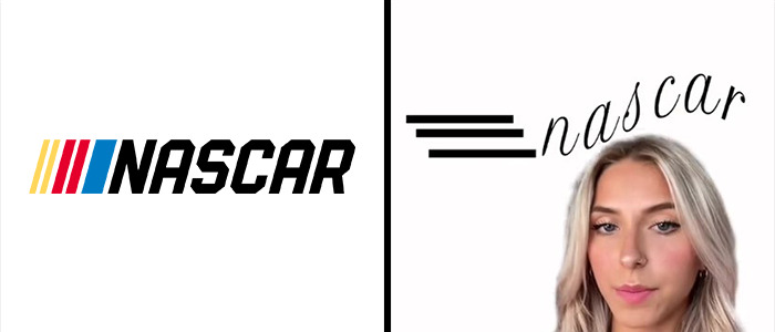
“First of all, starting with NASCAR, I don’t like this whole tilt that’s going on. And these lines are all very inconsistent. I just think, overall, it’s a really bad logo. This is my redesign. I wanted to make it look like the words were flying through the air at a very fast speed. This font overall is just more sophisticated as well.”

Image source: Emily Zugay
#13
“Next was Ocean Spray, the juice company. There’s a rule in graphic design where you only need one blue and a logo. I don’t know why you have basically three. So I took a more artistic approach and have a solid color blue that contrasts with a nice orange.”

Image source: Emily Zugay
 Follow Us


